Businesses generate more data than ever before, but many management teams still struggle to convert that data into clear decisions. Sales transactions, inventory movements, supplier records, customer behavior, operating costs, and performance metrics often exist in separate files and systems.
The result is a familiar problem: organizations have plenty of reports, yet still lack a dependable path from raw data to confident action.
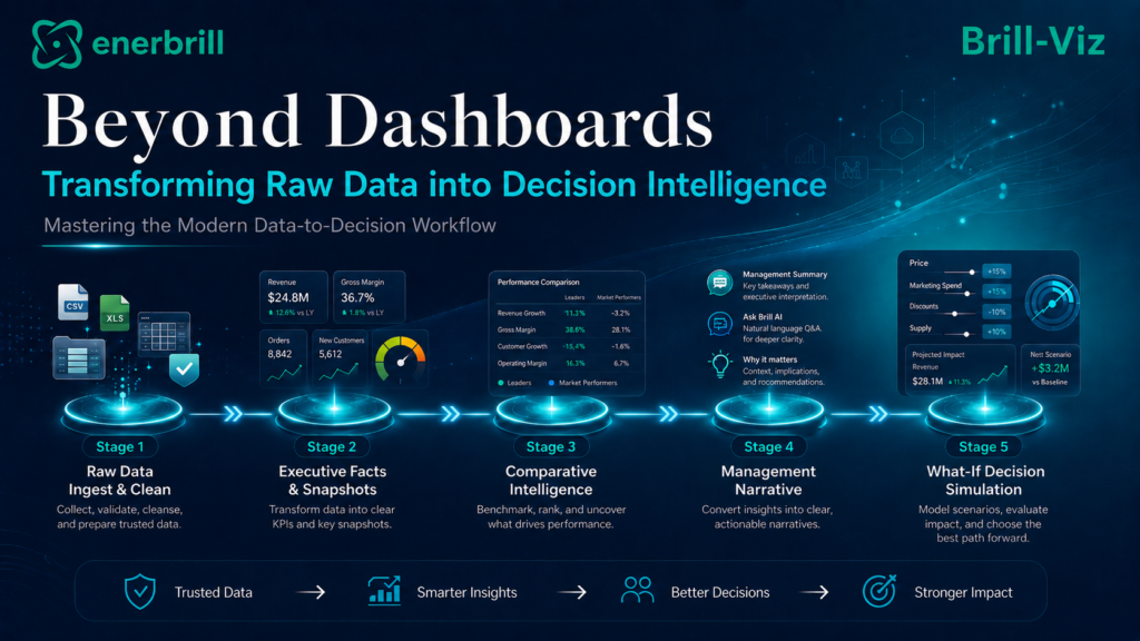
This workflow shows that the real challenge is not simply drawing charts. The modern analytical workflow begins with reliable data loading, transparent cleaning, traceable quality checks, and a clearly defined business context. Before charts are selected, the analyst should know which decision is being supported, which outcome or KPI matters, what problem must be resolved, and what analysis is required.
The workflow then moves into executive facts, comparative intelligence, management explanation, forecasting, predictive and prescriptive signals, management Q&A, and what-if sensitivity analysis.
This is the difference between a dashboard and decision intelligence. A dashboard shows what happened. A decision-intelligence workflow helps explain why it happened, what may happen next, which areas deserve attention, and what management can reasonably do about it.
Brill-Viz has been developed around this connected workflow. Its objective is not only to make analytics faster, but also to connect data preparation with business framing, purposeful analysis, transparent interpretation, and executive decision support.
This blog presents a five-stage walkthrough of turning raw data into decision intelligence, illustrated with screenshots.
The Data Challenge Has Changed
Most organizations are no longer asking how to collect data. They are asking how to make sense of it quickly, consistently, and safely. ERP systems, CRM platforms, point-of-sale systems, spreadsheets, accounting tools, supply systems, production logs, and online stores continuously generate information.
Each source may be useful, but each source can also introduce different formats, inconsistent categories, missing values, duplicate records, and conflicting business definitions.
This creates a decision bottleneck. Managers may receive several versions of the same KPI from different teams. Analysts may spend more time preparing data than interpreting it. Executives may receive reports after the business conditions have already changed.
In many cases, the organization does not need another dashboard. It needs a connected workflow that transforms imperfect data into trustworthy management intelligence.
The Brill-Viz workflow shown in the figures follows a deliberate sequence: load the data, inspect its quality, clean it transparently, review what changed, define the business context, formulate a working problem statement, and establish an analysis plan before moving into executive and comparative analysis.
This makes the analytical process easier to explain, easier to defend, and less likely to produce technically impressive but decision-irrelevant outputs.
Reliable decision intelligence starts with dependable data. IBM defines data quality through factors such as accuracy, completeness, validity, consistency, uniqueness, timeliness, and fitness for purpose.
These principles reinforce why business data should be inspected, cleaned, and reviewed before dashboards, forecasts, or recommendations are trusted.
Define The Analytical Mission Before Selecting Charts
A technically clean dataset is not yet a complete analytical starting point. The same columns can support many different questions, and an analyst can easily produce numerous valid charts that do not resolve the decision management actually faces. Brill-Viz, therefore, adds a Business Context step within Stage 1.
Using the selected dataset, column roles, units, and detected structure, the Business Context module prepares a reviewable draft of the domain, data scope, principal outcome or KPI, comparison dimensions, operational scope, and business objective.
It distinguishes likely outcomes from explanatory drivers, benchmarks, time fields, and identifiers so that a convenient numeric column is not automatically treated as the most important KPI. It then develops a Working Problem Statement that identifies the issue or uncertainty, the priority signals, what needs to be resolved, and the decision to support.
The user remains responsible for reviewing and refining this draft so that organizational knowledge is not replaced by automation.
The resulting Analysis Plan converts the problem statement into a practical analytical route. It raises only questions that are pertinent to the detected dataset and indicates whether each question is ready for analysis, requires additional checks, is only partly supported, or needs more data.
For each question, the plan identifies the measures to calculate, groups or periods to compare, data-quality limitations to monitor, and the most suitable Brill-Viz route, such as an Executive Snapshot, Comparative Intelligence, Smart-Stats, Grouped Stats, distribution analysis, time-series forecasting, Auto-Pivot-Charts, or specialist visuals.
The Business Context module does not answer these questions; it defines a disciplined route for developing the evidence.
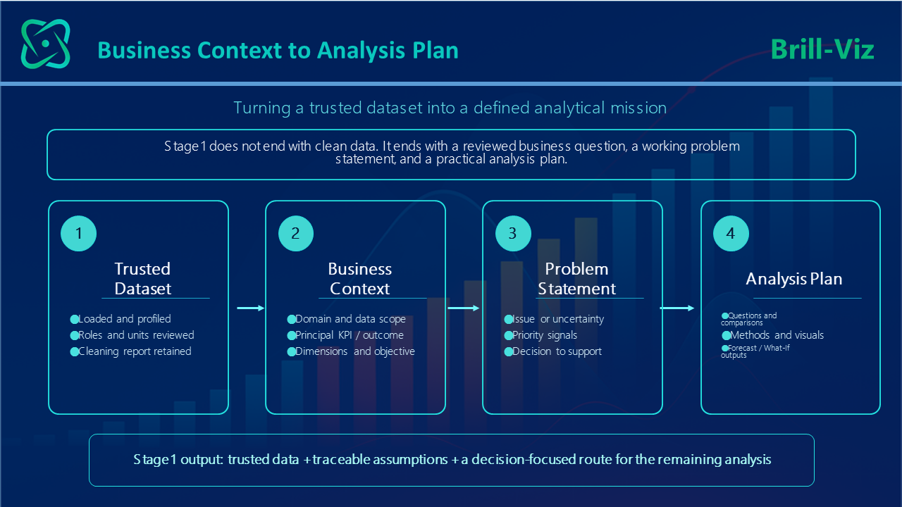
Stage 1, therefore, produces more than a cleaned file. Its output is a trusted dataset, a traceable record of what changed, a reviewed statement of the business problem, and an analysis plan that guides the remaining four stages.
Stage-1: Load, Clean, Frame the Business Problem, and Plan the Analysis
Before any meaningful business analysis can be performed, the dataset must be technically prepared and its business purpose must be defined. Poor data preparation can create misleading conclusions, while poor problem framing can produce accurate analysis of the wrong question.
Figure 2 illustrates the first part of the Brill-Viz workflow: the user loads the dataset, reviews the data summary, runs Smart Auto-Clean, examines the Auto-Clean report, saves the cleaned file, and then continues with a trusted analytical sheet.
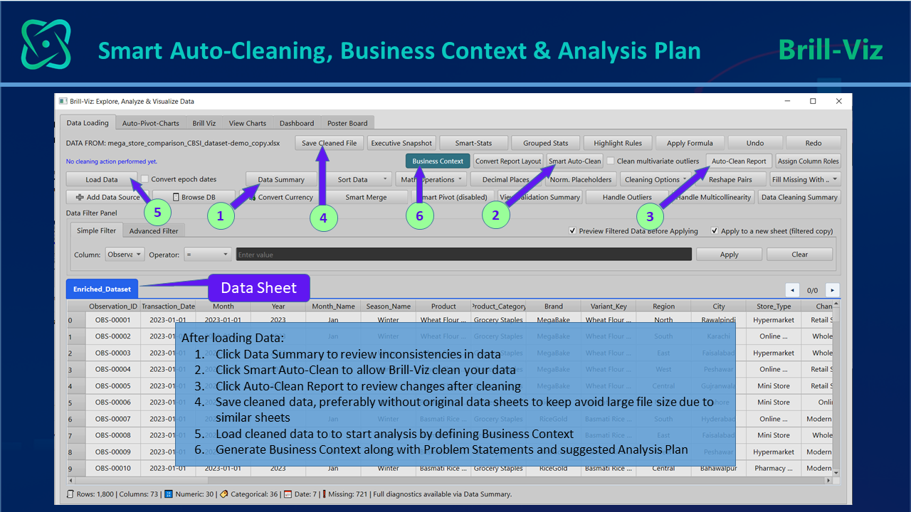
This sequence separates useful automation from blind automation. The user is not simply asked to trust that the software did something useful. The workflow encourages review of the data summary, the cleaning process, the cleaning report, and the saved cleaned output. It then adds a second safeguard: the analyst defines what the data means, which decision is being supported, and how the analysis will answer that decision.
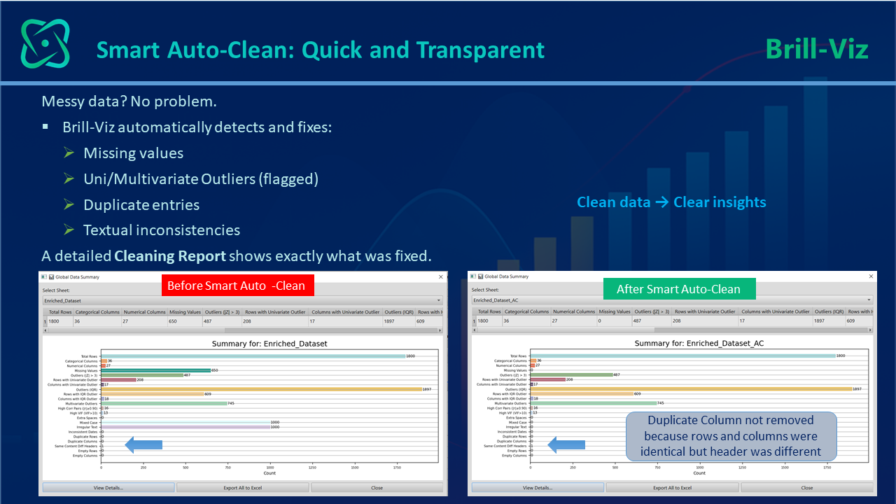
Figure 3 reinforces the purpose of Smart Auto-Clean. Business datasets commonly contain missing values, duplicate entries, textual inconsistencies, inconsistent formatting, and abnormal observations. A useful cleaning system should reduce this burden while preserving confidence in the result.
The before-and-after view is therefore not just a visual feature; it is a governance feature. It allows users to see that cleaning has occurred and that the dataset has become more analysis-ready.
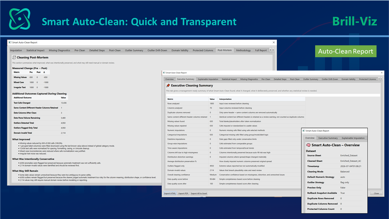
A major concern with automated cleaning is that it can become invisible. When values are silently changed or records are silently removed, users may not know whether the final results remain reliable. The Smart Auto-Clean report, partly shown in Figure 4, addresses that concern by explaining what was detected, what was fixed, and what may still require user review.
This is especially important for business users who need confidence before presenting conclusions to management.
Stage 2 - Convert Trusted Data into Executive Facts
Once data has been cleaned, validated, and placed within a reviewed business context, the next requirement is to translate it into management-ready facts. Executives rarely need every column and every record. They need a reliable summary of the defined outcome or KPI, business health, major changes, risk signals, leading categories, weaker areas, and potential next steps.
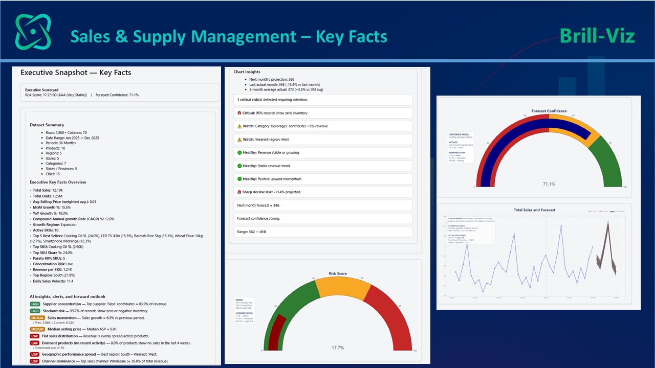
Figure 5 demonstrates this transition from prepared and framed data to executive facts. The Sales and Supply Management snapshot combines key facts, health gauges, trend signals, and forecast-oriented views. Instead of forcing users to build these components manually in separate tools, Brill-Viz presents them as part of the same connected analytical workflow.
Industry-aware Executive Snapshot modules provide rapid orientation through Key Facts, Tables, Charts, and chart-aware interpretive summaries.
In the updated workflow, relevant templates can also carry the pertinent questions from the analysis plan into an evidence-linked answer register, supported by calculations, statistical evidence, confidence or caution, and the chart or analysis that supports each answer.
Because the business problem and principal KPI have already been defined, these snapshots can be read as evidence for a decision rather than as a collection of unrelated metrics.
Auto-Pivot-Charts and customized charting options are also available, with many charts coupled with chart-aware interpretive summaries. These capabilities will be covered in upcoming blogs in the Brill-Viz series.
This type of snapshot is useful because it gives management an immediate orientation. It addresses the first layer of questions: What is the current business condition? Which indicators look healthy? Which indicators need attention? What does the trend suggest?
The revised Q&A-enabled templates go further by selecting only pertinent and executable questions and linking each answer to calculated evidence rather than generic narrative. Where the available data cannot support a complete answer, the limitation remains visible instead of being hidden.
These questions do not replace deeper analysis, but they make that deeper analysis faster, more focused, and easier to audit.
Stage 3 - Compare Performance, Leaders, Weaknesses, and Concentration
Most business decisions are comparative. Managers compare products, variants, regions, brands, cities, channels, branches, months, suppliers, and customer groups. A simple chart can show differences, but management usually needs more than visual comparison. It needs to know who is leading, who is weakening, how large the leadership gap is, how concentrated performance is, and whether a change is temporary or meaningful.
The dimensions and questions identified in the Stage 1 analysis plan help ensure that these comparisons are purposeful rather than exploratory for their own sake.
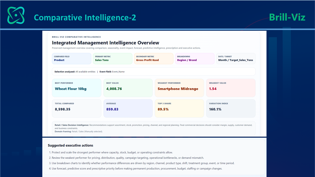
Figure 6 shows how comparative intelligence can summarize these issues through executive KPI cards. Instead of presenting only raw totals, the view highlights total comparisons, the current leader, the weakest performer, latest movement, average versus median behavior, leadership gap, top-share concentration, variation index, best and slowest months, future leader signals, and watchlist items.
These indicators convert comparison into decision context. Comparative decision intelligence reveals leaders, laggards, concentration, and movement.
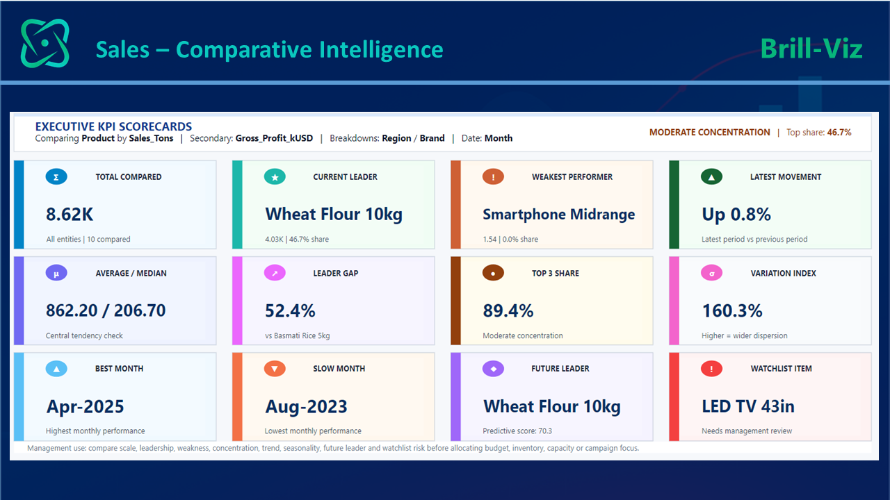
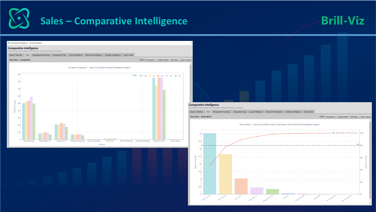
Figure 7 extends the same idea into visual comparison. Grouped bar charts and Pareto-style views help identify which products or categories contribute most to sales, where concentration exists, and which entities may need attention.
This matters because management action is rarely equal across all products. A small number of entities may drive a large share of performance, while other entities may consume attention without creating proportional value.
Stage 4 - Explain Findings, Forecast Outcomes, and Recommend Action
A recurring weakness of traditional dashboards is that they often stop at visual evidence. Executives still need to know what the evidence means, what may happen next, and which responses deserve consideration. They ask: Which item is the current leader? What changed? Which item is at risk? What should we monitor? What actions deserve priority?
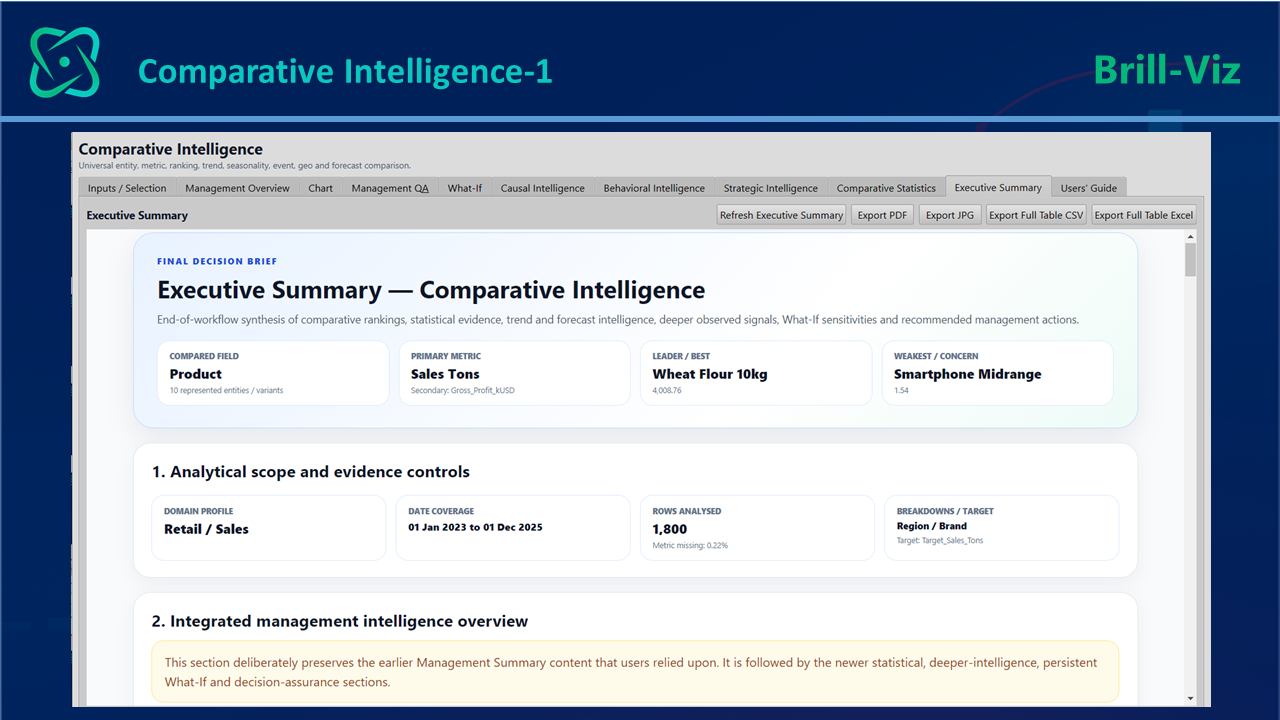
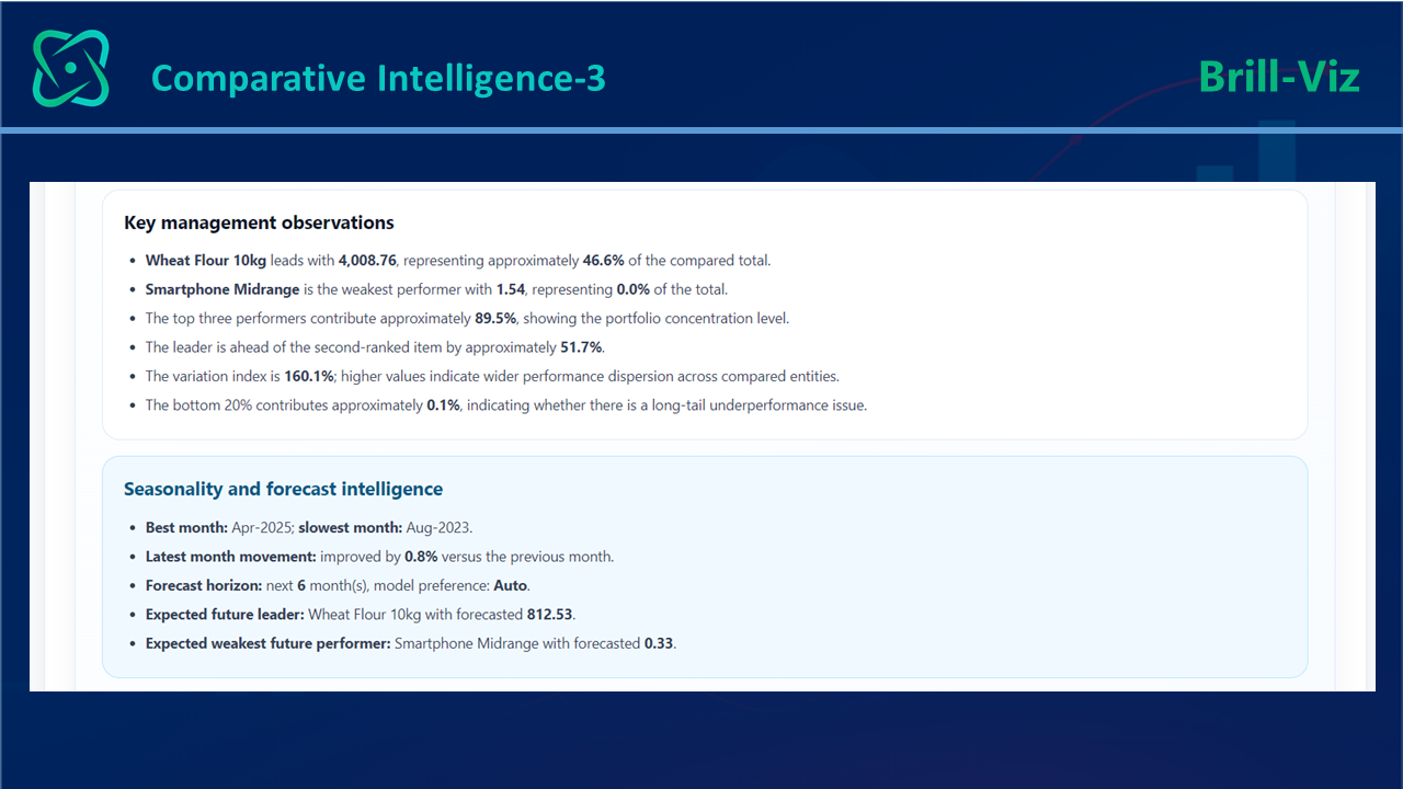
Figures 8 (1-5) present an integrated summary for management, where the analysis is translated into business-language explanations, forecast-oriented signals, and evidence-based recommendations.
This is important because it turns technical comparison into an executive briefing. It identifies key indicators such as leader, best month, weakest item, comparison basis, and overall performance signals. It also converts those indicators into observations that can be read and discussed without requiring the reader to inspect every chart.
From comparison the summary expands into forecast and event or seasonal intelligence. This is where analysis begins moving beyond historical reporting. Instead of only asking what happened, the workflow asks whether recent performance may continue, whether seasonal or event-related factors may be influencing the result, and which upcoming conditions should be considered in planning.
Forecasts are decision inputs, not guarantees, and should be interpreted alongside data quality, business context, and known operational constraints.
With forecast, predictive and prescriptive recommendations are also generated. In business terms, this is where analytics becomes more useful for action.
Decision intelligence becomes actionable when forecasts and recommendations are linked to evidence.
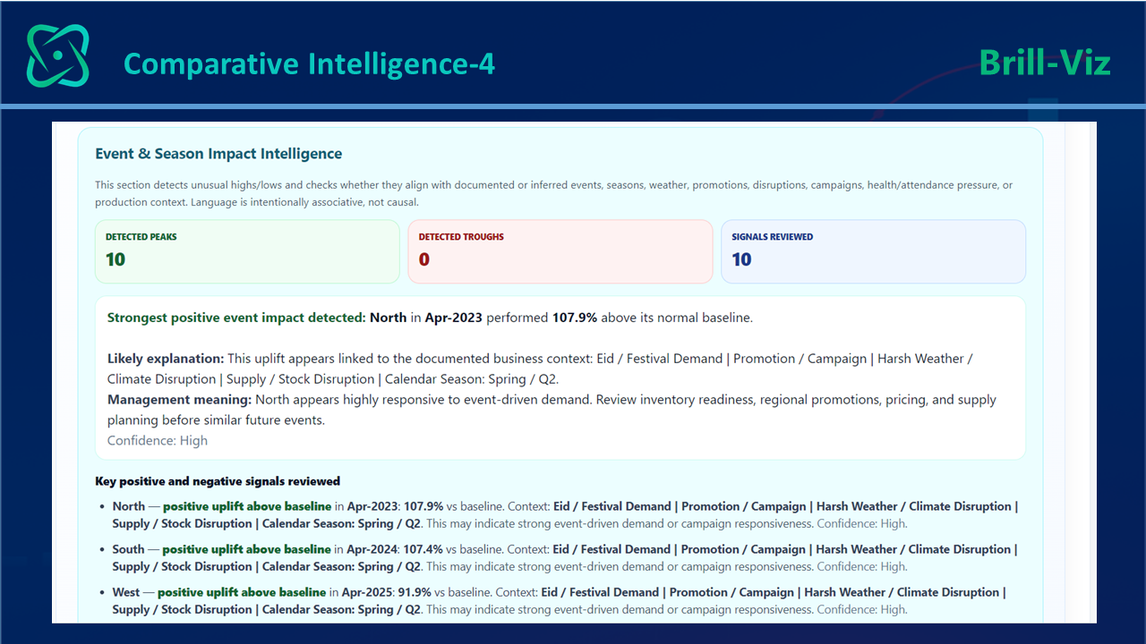
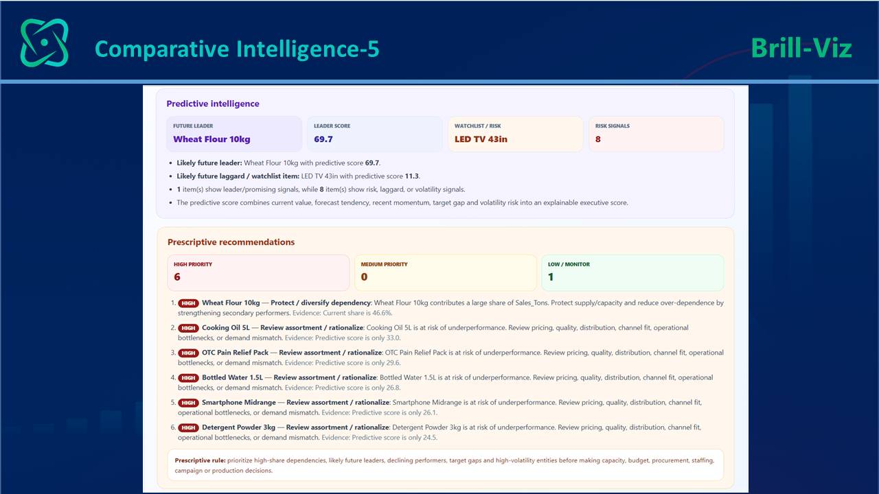
The system does not merely identify strong and weak performers; it helps translate those findings into recommended attention areas, possible corrective actions, and risk-focused follow-up. This does not remove the need for management's judgment; it strengthens that judgment by organizing evidence, exposing assumptions, and highlighting priorities.
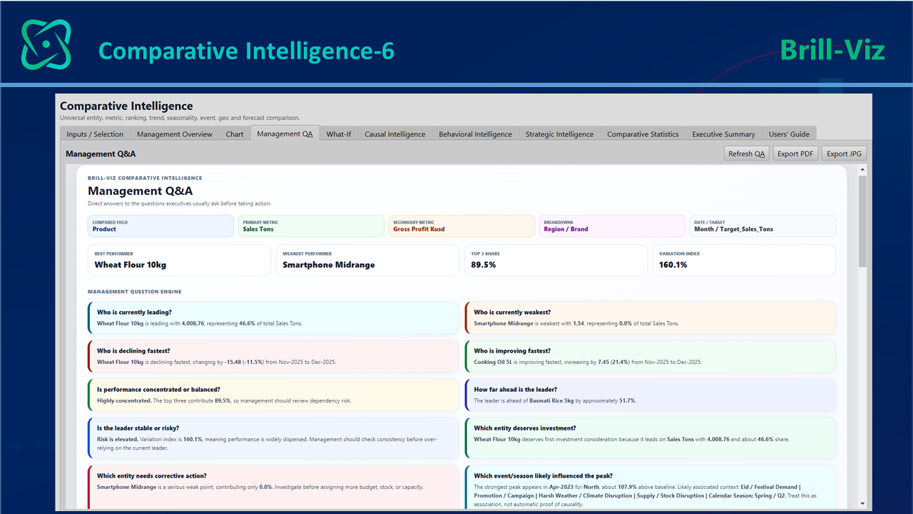
Figure 9 shows the management-concerns view. This is a particularly practical layer because executives often think in questions, not chart types. They ask which product is growing fastest, which product is weakening, where performance concentration is highest, what is likely to lead in the future, and which items need attention.
In the revised workflow, these are not merely fixed prompts: the template screens the dataset for pertinent questions, pursues the supported calculations and statistical evidence, and records a direct answer, confidence or caveat, and supporting visual.
Questions that cannot yet be answered identify the missing evidence or next analysis required. This helps bridge the gap between analytical outputs and real management conversations.
The next important step for management is to understand the evidence and identify candidate actions before testing how robust those actions are under alternative conditions, i.e. 'What-If' simulation.
Stage 5 - Stress-Test Decisions with What-If and Sensitivity Analysis
Even after a management team understands current performance and the available response options, it still faces uncertainty. What if prices change? What if demand improves or declines? What if a region loses momentum? What if a supply disruption affects a key category? What if one product receives more investment than another?
These are not merely reporting questions; they are scenario and sensitivity questions about how dependent a decision is on its assumptions.
Figure 10 shows the What-If scenario simulation layer. This capability helps users examine possible business outcomes before acting. Scenario analysis tests coherent combinations of changes, such as a price increase together with a volume response or a supply disruption together with revised allocation. Sensitivity analysis asks which individual assumptions or drivers have the greatest influence on the selected KPI.
Used together, they help management compare directional and percentage impacts, identify fragile decisions, and focus attention on the assumptions that matter most.
The objective is not to predict one exact future; it is to understand the range of plausible consequences before committing to action.
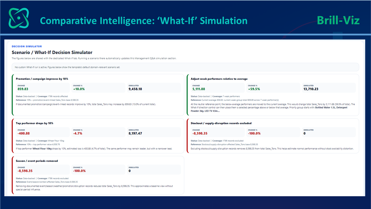
This framing makes the What-If layer stronger than a simple percentage calculator. It becomes a transparent stress test of the recommendation developed in Stage 4 and a bridge between analysis and management judgment.
Why This Matters for Modern Business Analytics?
The full workflow shown across the figures illustrates what a single continuous analytical thread looks like in practice. A complete workflow should help users prepare data, verify quality, define the business context, formulate a working problem statement, establish an analysis plan, summarize facts, compare performance, explain changes, forecast likely outcomes, identify watchlist items, recommend attention areas, and stress-test possible actions.
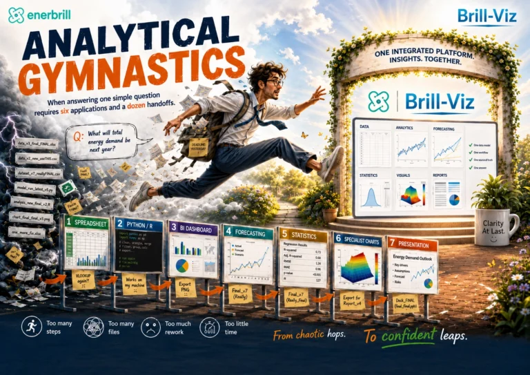
This connected approach also improves consistency. When data preparation, business framing, analysis, visualization, comparative intelligence, forecasting, simulation, and reporting are performed in separate tools, every handoff creates the possibility of inconsistency. A connected workflow reduces duplication and preserves a single analytical thread from original data and documented assumptions to executive interpretation.
Transparency is equally important. Business users and decision-makers must be able to understand how data was cleaned, how the business problem was framed, what assumptions were made, why a particular question was raised, which analytical route was selected, and what evidence supports the answer.
This is why the cleaning report, Business Context output, capability-led analysis plan, Executive Snapshot, evidence-linked Q&A register, management summary, and What-If simulator are not separate ideas. Together, they form a practical decision-intelligence chain.
Business intelligence helps organizations transform data into useful insights and support data-driven decisions. Decision intelligence extends this process by connecting those insights to a defined KPI, business problem, recommended response, and management decision.
Key Takeaways
Closing Remarks
The five stages walked through above are one continuous decision process, expressed through a sequence of questions: What decision are we trying to support? Is the data fit for that purpose? What is happening? Why is it happening? What may happen next? Which response is reasonable? How sensitive is that response to changing assumptions? Splitting these questions across disconnected tools is where analytical workflows quietly lose time, context, and consistency.
The figures in this blog show what that continuity looks like. Brill-Viz begins with data loading, Smart Auto-Clean, and a reviewed Business Context, Working Problem Statement, and capability-led Analysis Plan. The planning stage raises pertinent questions and identifies the Executive Snapshot, statistical test, forecast, comparison, or visual best suited to investigate each one.
The relevant templates can pursue those questions, return evidence-linked answers where the data permit, and explicitly preserve partially answered or unresolved items. The workflow continues through executive facts and comparative intelligence, then moves into management explanations, forecast and recommendation signals, concern-based Q&A, and What-If sensitivity analysis.
Brill-Viz is a commercial business intelligence and decision analytics platform developed by enerbrill. It is designed to help organizations transform raw business data into actionable management intelligence through integrated data preparation, business-context definition, problem framing, analysis planning, visualization, statistical insight, forecasting, predictive intelligence, prescriptive recommendations, sensitivity analysis, and executive decision support.