Monday Morning: The Assignment Arrives
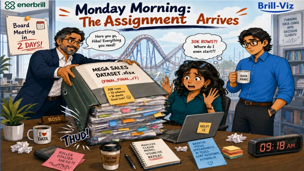
At 9:18 am, Hiba's boss entered her office carrying a dataset and the confident smile of someone who was about to transfer a very large problem to somebody else.
The dataset contained several sheets, thousands of rows, dozens of columns and enough colors to suggest that several departments had edited it independently.
"Hiba", he said pleasantly, "our client has a board meeting in two days". Hiba looked at the workbook; "They need a complete analysis", the boss continued.
"Complete?" Hiba asked cautiously.
"Yes. Clean the data, define the business problem, identify the important KPIs, compare products, regions and channels, examine sales and supply performance, run the statistics, explain the trends, forecast the next few periods and provide recommendations".
He paused at the door. "And every chart should have a supporting table and a clear interpretation. The board members do not want to figure out what the visuals mean themselves". Then he left.
Hiba stared at the screen. A small imaginary roller coaster appeared behind her desk, the safety bar lowered automatically.
The Dataset Introduces Itself
Hiba opened the first sheet. Some dates were stored as dates, others as text. A few appeared to have travelled directly from 1970.
Product names included:
Revenue contained blank cells.
Discount percentages contained currency symbols.
Supplier names appeared in the sales-region field.
Some quantities were stored as text, while several identification codes were behaving suspiciously like continuous numerical measures.
One column contained "Yes", "No", "N/A", "Pending", "0" and the occasional smiley face.
Hiba opened the second sheet. The column names were different.
She opened the third and the units were different.
She opened the fourth, the business meaning was different.
The imaginary roller coaster started moving, slowly at first.
The Toolbox Parade
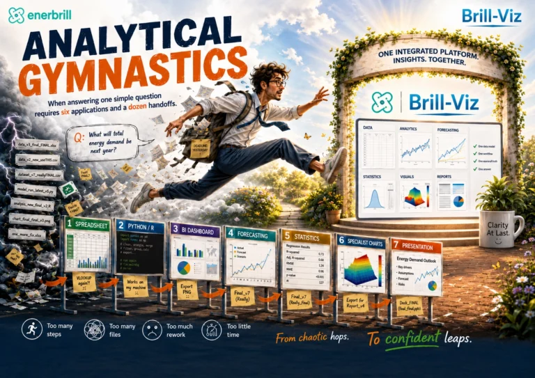
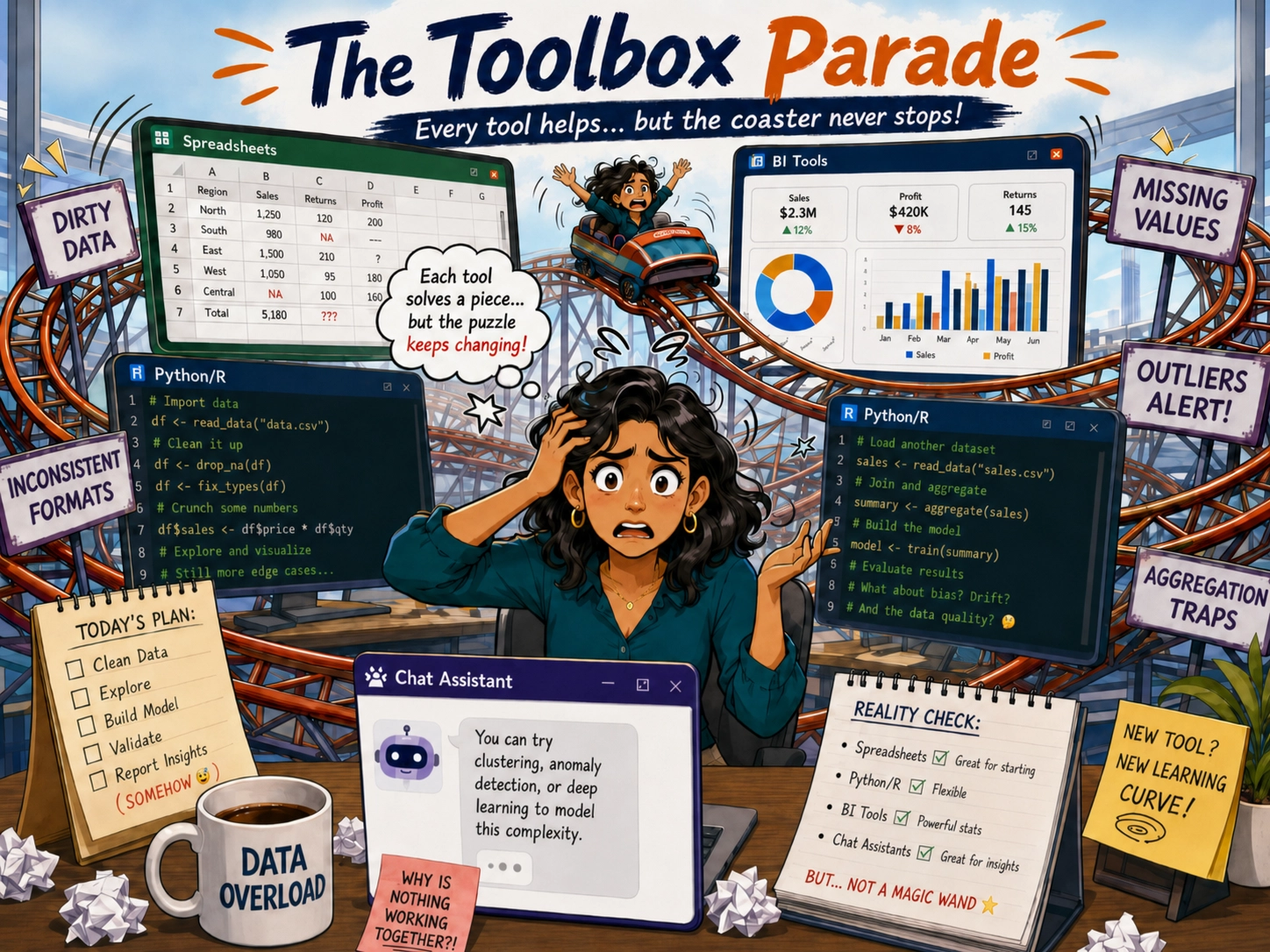
Hiba opened a spreadsheet. It offered formulas, filters, pivot tables and approximately four hundred opportunities to click the wrong cell.
She opened a BI tool. It asked her to define relationships, measures, dimensions, hierarchies, date tables and what appeared to be the philosophical meaning of revenue.
She opened a Chat Assistant., which confidently suggested several analyses before the data had been cleaned, profiled or properly explained.
She opened Python, a blank coding window greeted her with the calm silence of a surgeon waiting for Hiba to identify the patient, the diagnosis and the required operation.
Every tool was powerful Every tool could , capable of solving part of the problem. But Hiba still had to move the data between them, maintain consistent calculations, validate the results, construct the charts, prepare the tables, run the statistics and somehow turn everything into one coherent boardroom story.
She now had several applications open, few browser tabs, three unfinished scripts and one spreadsheet that had stopped responding.
The roller coaster climbed higher.
The Real Problem Was Not Making a Chart
Hiba could certainly create a bar chart, that was not the problem.
The client had provided a broad assignment, but Hiba could already imagine the questions that would arise in the boardroom:
A chart could show that Region North was declining. But was it declining because of:
Lower demand?
Higher discounts?
Reduced product availability?
A disappearing product line?
Stockouts?
Supplier delays?
A change in customer mix?
Missing records?
Or because somebody had entered monthly revenue in thousands on one sheet and full currency values on another?
Hiba realized she was not preparing a dashboard, but an argument which is supported by trusted data, a clear business context, suitable visuals, supporting tables, statistical evidence, forecasts, scenarios and defensible recommendations.
The roller coaster reached the top, from where Hiba could clearly see two sleepless nights.
Tuesday Morning: Analytical Turbulence
By the next morning, Hiba had produced twelve charts; Three had conflicting totals two contained categories that should have been dates, one forecast predicted negative customers and a correlation chart showed that Observation ID was strongly related to almost everything.
Her statistical output contained several p-values, none of which had volunteered to explain themselves. Hiba started writing the interpretations manually!
She read the sentence again. It was technically true, but analytically useless.
She placed her head on the desk. At that moment, Harith, who noticed her fumbling with files and tools, came to her desk, "Hiba, are you analyzing the data", he asked, "or the data is analyzing you?"
Hiba pointed towards the screens", I need cleaned data, a business problem statement, KPIs, charts, tables, statistics, drivers, forecasts, what-if scenarios, interpretations and recommendations by tomorrow".
Harith looked at the opened spreadsheet, the BI model and the scripts. Then at the coffee cups, "You appear to be building an entire analytics department, alone, and before tomorrow!"
Harith Finds the Exit
"Have you tried Brill-Viz?" Harith asked. Hiba looked suspicious, "Harith, please I do not need another charting tool". "Good," Harith continued, "Because your problem is not the absence of charts"
He closed three duplicate spreadsheets and opened Brill-Viz on his machine.

"Start with the data," he said.
The workbook was loaded. Brill-Viz profiled the selected sheets and highlighted missing values, inconsistent text, suspicious dates, unusual observations and other potential issues in the data. Harith also showed Hiba to inspect column-role problems, particularly fields that looked numerical but represented categories, identifiers or codes. Instead of immediately producing colorful visuals, it first showed Hiba what could prevent those visuals from being trusted.
Hiba reviewed the detected issues, assigned correct columns roles and then Harith further showed her Smart Auto-Cleaning option. The system standardized text, treated missing values according to the selected cleaning approach, checked dates, reviewed duplicates, flagged outliers, which Hiba later clipped, and prepared a transparent cleaning report.
Hiba could feel several warning indicators disappeared. A few business-specific fields still required judgement, so Hiba used Assign Column Roles again to define them exactly as intended.
The cleaning report showed what had changed and allowed the adjustments to be traced. For this dataset, the post-clean profile retained approximately 99.5% similarity with the original statistical characteristics while correcting the identified quality problems.
In around ten minutes, the roller coaster began to slow down.
First Stop: What Business Problem Are We Solving?
Harith opened the 'Business Context' module. Before generating the analysis, Brill-Viz examined the available fields and proposed:
Hiba reviewed and refined the proposed context.
The assignment was no longer:
Instead, it became:
For the first time, every analytical step had a purpose.
"We have not even created a chart yet", Hiba said, "and things already making more sense". "That", Harith replied, "is because a business question is not a decorative title added after the dashboard is finished".
Second Stop: Sales & Supply-Chain Management
Hiba selected the Sales & Supply-Chain Management Snapshot template. No more building every chart, calculation and interpretation from scratch. Brill-Viz organized the analysis around the dataset and its business roles instead.
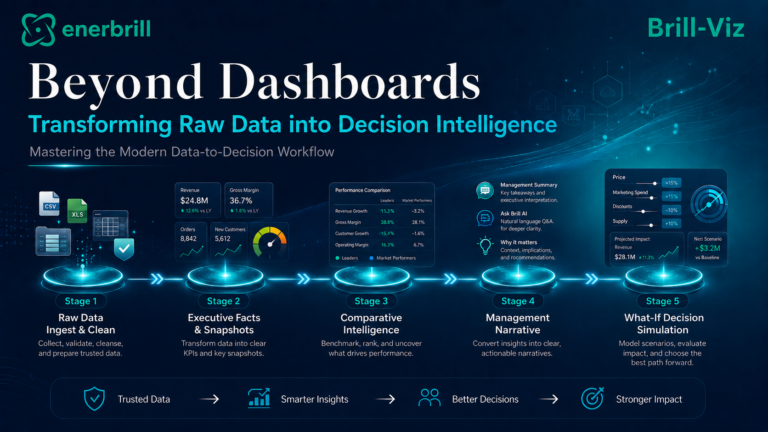
The analysis was arranged into a connected sequence:
Key Facts, Executive Overview and Analysis Plan established what the dataset contained, which business questions could be answered and where the analysis should focus.
Charts, Tables and KPIs presented sales, profit, volume, discount, product, category, regional, channel and customer performance from multiple decision-oriented perspectives.
Supply Chain Management examined available indicators such as inventory cover, stockout exposure, supplier concentration, expiry risk, damage, wastage, returns and lead-time behaviour - where the required fields existed.
Statistics, Drivers & Causes, Forecast Intelligence, What-If, Recommendations, Interpretive Summary and Alerts moved the work from reporting into decision support.
Each analytical view could connect the chart with:
Hiba no longer had to create a chart in one place, calculate its table elsewhere, run a separate statistical procedure and then manually reconcile all three outputs.
The Charts Began Telling a Story
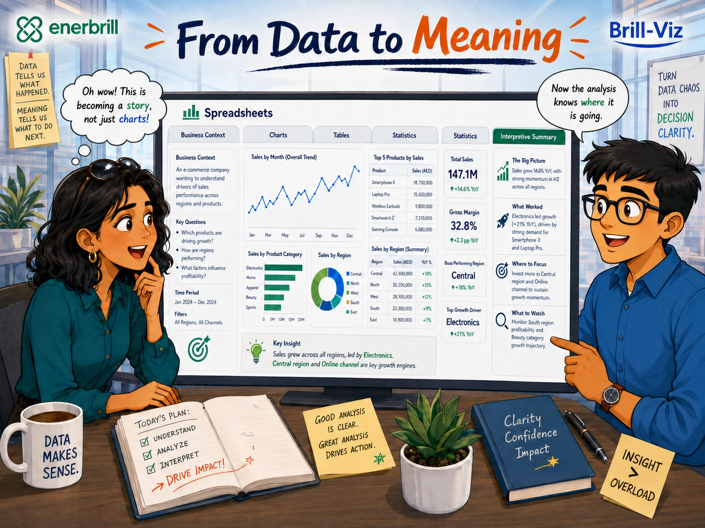
Hiba clicked through the results. A regional comparison did not merely display different bar heights. Its supporting table provided the exact values. Its interpretation identified the strongest and weakest regions, described the size of the differences and highlighted which comparisons warranted further investigation.
A product trend did not merely draw a line but described direction, volatility, recent movement and possible commercial implications.
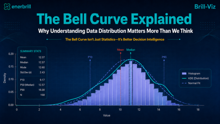
A distribution view explained central tendency, spread, skewness and unusual observations.
The sales analysis distinguished revenue growth from unit growth and margin movement.
The supply view highlighted where apparent demand weakness could be associated with stock availability, supplier concentration, wastage, returns or lead-time pressure. "This would have taken me hours per chart", Hiba said.
"And you would still have needed to check whether your written explanation matched the table and the stats", Harith replied.
The Statistics Finally Speak Human
Hiba opened the Statistics and Interpretive Summary sections.
Instead of presenting statistics as a collection of mysterious rituals, the analysis connected them with practical questions:
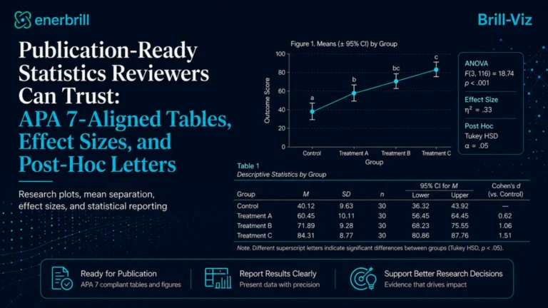
Confidence intervals helped Hiba understand the likely range around estimates.
Normality and outlier guidance helped her judge whether conventional comparisons were appropriate.
Variance checks helped determine whether a standard comparison or a more robust alternative was preferable. Effect sizes helped distinguish an important business difference from a tiny difference that had merely become statistically detectable because the dataset was large.
Brill-Viz was not asking Hiba to surrender professional judgement, it was removing the repetitive mechanical work that had previously prevented her from using that judgement properly.
The roller coaster had now transformed into a guided train. There were still turns, but at least the track had signs.
Drivers, Causes and the Questions Behind the Charts
The Drivers & Causes section helped Hiba investigate the patterns behind the headline results.
A revenue decline could be examined alongside:
Brill-Viz did not claim that every correlation proved a cause. Instead, it surfaced plausible drivers, measurable associations and operational signals that deserved investigation.
Hiba could now separate:
from
The second statement was useful. The first was merely a symptom.
Forecasts, What-Ifs and Recommendations
The client also wanted a forward-looking view. Hiba selected the relevant time field and principal outcome.
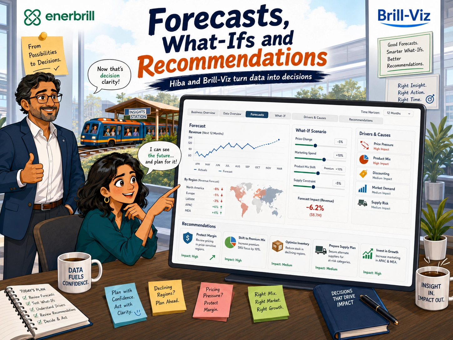
The forecast displayed historical performance, the expected continuation and the uncertainty surrounding future values. Where sufficient data existed, forecasts could also be examined by product, category, region or channel. Forecast quality was not represented by a decorative dotted line alone. Validation measures helped Hiba judge whether the model was sufficiently reliable for planning.
The interpretation did not announce the future as a certainty. It explained the expected direction, recent momentum, potential error and the conditions under which the outlook might change.
Hiba then opened the What-If section. Instead of guessing out loud in meetings, she could test structured scenarios involving:
She tested what might happen if discounting increased. She examined the effect of recovering lost sales from stock-outs. She explored whether shifting towards higher-margin products could improve profitability even if total units remained broadly stable. She tested how supply constraints might weaken an otherwise positive sales forecast.
The scenarios did not predict management decisions with certainty; they made the assumptions visible and quantified their possible consequences.
From Signals to Recommendations
Hiba reviewed the combined evidence. No single chart had said all of this.
Together, they did:
The recommendations practically wrote themselves, but Hiba reviewed and refined them carefully:
Every recommendation could now be traced to a chart, a table, a statistical result, a forecast or a scenario. The advice was no longer based on inspiration; it was linked to evidence.
Wednesday Morning: The Board Pack
The boss returned; he expected to find Hiba surrounded by empty coffee cups, unfinished scripts and the remains of a nervous breakdown. Instead, she showed him:
The boss looked through the analysis, "This is exactly what the client requested", he said. Then he looked at Hiba, "How did you complete all this so quickly?"
Hiba glanced at Harith; Harith smiled, "We stopped treating every stage of analysis as a separate expedition".
The Board Meeting
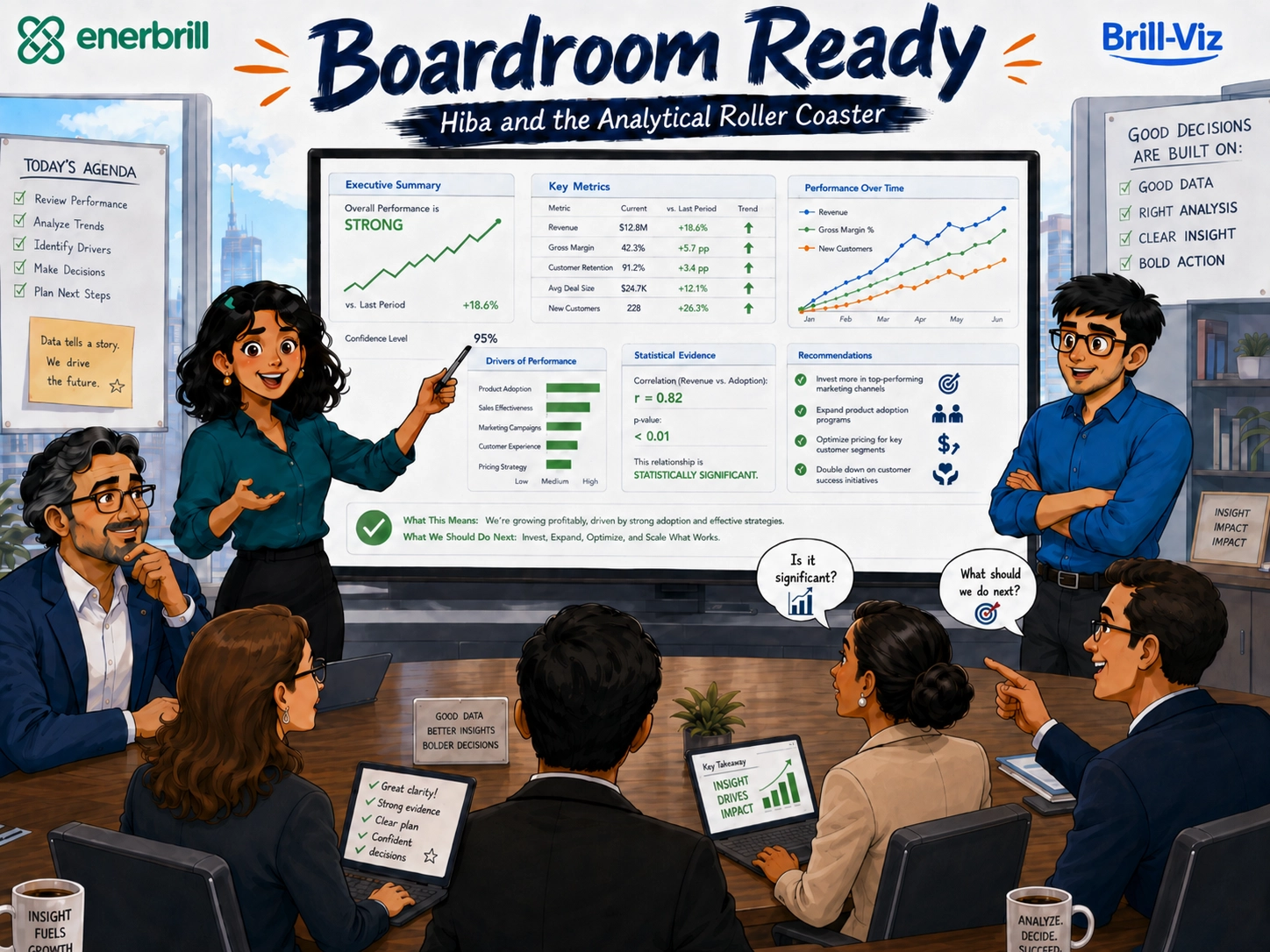
At the meeting, one director pointed to a declining regional trend: "What does this mean?" The interpretation and supporting table were already available.
Another asked: "Is the difference between the regions statistically meaningful?" The statistical evidence was ready.
Another participant asked: "Are sales falling because of demand, pricing or availability?" The Drivers & Causes analysis provided the relevant evidence.
The operations director asked: "Do we have any supply risks?" The supply-chain indicators highlighted the available stock, supplier and lead-time signals.
Another board member asked: "What happens if we increase the discount?" The what-if scenario was ready.
The chairperson asked: "What happens if the current trend continues?" The forecast, with its assumptions and uncertainty, and comparison with what-if scenario simulations was ready.
Finally, the chairperson asked: "So what should management do next?" The recommendations were linked directly to the evidence.
Nobody asked Hiba to explain why three charts showed three different totals. Nobody had to decode a p-value during the meeting. Nobody had to guess what the dashboard designer intended.
The analysis did not merely decorate the boardroom screen; it supported the boardroom conversation.
After the Meeting
Back at the office, the boss congratulated Hiba, "Excellent work. Since that went so smoothly, I have another dataset". Hiba looked at Harith, who quietly opened Brill-Viz.
Some roller coasters, after all, never close. But they help to know where the controls are.
Key Takeaways
The Analytical Lesson
The most time-consuming part of analysis is rarely the physical act of drawing a chart.
The real workload lies in moving reliably:
Spreadsheets, BI tools, Chat Assistants and Python/R are all powerful, but completing every stage separately - especially under a tight deadline can turn a seemingly straightforward assignment into an analytical roller coaster.
Brill-Viz is designed to bring these stages into one connected and transparent workflow, so nobody has to rebuild the same argument many times in several different windows:
Because, the client rarely asks only for a chart.
The client wants to know: