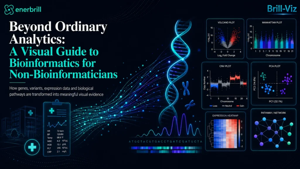
Introduction: A world of data beyond patient records
When analysts hear the term healthcare analytics, they commonly think about hospital admissions, patient demographics, treatment costs, laboratory results, bed occupancy, readmission rates and clinical outcomes. These are important areas of analysis, but they represent only one layer of healthcare information.
Behind every patient record is another, less visible layer of data: genes, proteins, mutations, chromosomes, biological pathways and molecular activity. This is the world of bioinformatics.
For readers who are new to the field, the National Human Genome Research Institute provides a clear definition of bioinformatics and explains how computational methods help organize, analyze and interpret biological information.
Bioinformatics combines biology, computing and quantitative analysis to collect, organize and interpret biological information. In genomics, it is used to examine data such as DNA sequences, gene expression and annotations describing biological features. These analyses can help researchers study how biological systems function and how they may be connected with health and disease.
For many ordinary analysts, however, bioinformatics remains unfamiliar territory. Its terminology appears highly scientific, its datasets can be enormous, and many of its most important visualizations are rarely encountered in conventional business intelligence.
Yet the fundamental analytical questions are surprisingly familiar:
The difference lies in the type of data being studied, and in the specialist visual language needed to understand it.
Healthcare Analytics And Bioinformatics Are Related, But Not Identical
Traditional healthcare analytics generally begins with information attached to a patient, visit, hospital, procedure or clinical outcome.
A hospital analyst may investigate:
Bioinformatics works at a different level. It may investigate:
Gene expression, for example, refers to the process through which information encoded in a gene is converted into a functional product, commonly through RNA transcription. Expression measurements can therefore indicate how actively particular genes are functioning under different conditions.
Bioinformatics is not a replacement for healthcare analytics. It adds another level of evidence. Clinical data may show that two groups respond differently to treatment. Bioinformatics may help researchers explore whether their gene-expression profiles, mutation patterns or biological pathways also differ.
That connection is one reason bioinformatics is becoming increasingly relevant beyond the traditional community of geneticists and computational biologists.
Why Bioinformatics Feels Inaccessible To Ordinary Analysts
The problem is not simply that bioinformatics uses unfamiliar terminology.
Ordinary analytical work often begins with a rectangular table in which:
Bioinformatics datasets may behave differently. An expression dataset can contain measurements for thousands of genes across a much smaller number of biological samples. A genomic association dataset may contain hundreds of thousands or millions of tested variants distributed across chromosomes. A mutation dataset may need to show several types of genomic alteration across many genes and samples simultaneously.
Even when the underlying data are stored in ordinary rows and columns, their analytical meaning is not ordinary.A bar chart may show the ten genes with the largest fold changes, but it cannot by itself explain whether those changes are statistically reliable.
A scatterplot may show sample separation, but without suitable dimensionality reduction, thousands of molecular variables cannot be meaningfully represented on two axes. A heatmap may look impressive, but without normalization, suitable scaling and careful interpretation, its patterns may be misleading.
Bioinformatics, therefore, requires more than software capable of drawing charts. It requires visual literacy: an understanding of what each chart represents, what data it requires, and what conclusions it can and cannot support.
The Specialist Visuals Every Analyst Should Understand
1. Volcano Plot: Finding Changes That Are Both Large And Statistically Notable
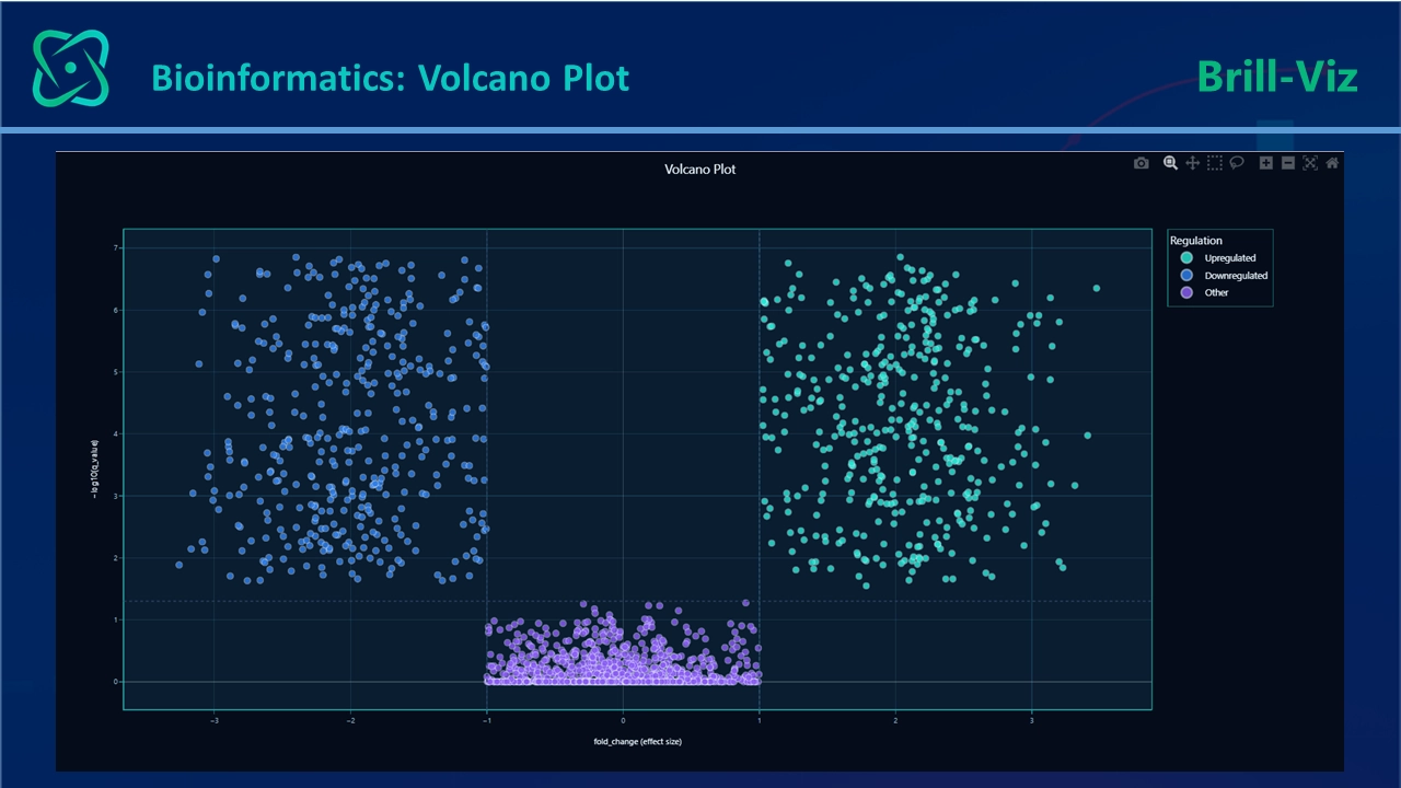
A volcano plot is one of the most recognizable visuals in gene-expression analysis. Each point normally represents a gene or another measured biological feature.
The horizontal axis shows the size and direction of change, often expressed as log₂ fold change. Points to the right represent increased expression, while points to the left represent decreased expression.
The vertical axis represents statistical significance, usually expressed as −log₁₀(p), meaning the negative base-10 logarithm of the p-value. Because smaller p-values produce larger −log₁₀(p) values, points appearing higher on the plot indicate stronger statistical evidence. For example, p = 0.01 corresponds to 2, while p = 0.001 corresponds to 3. Higher points have smaller p-values and therefore stronger statistical evidence under the fitted analysis.
The most noticeable candidates often appear in the upper-left and upper-right areas: they combine relatively large changes with relatively strong statistical evidence. Volcano plots are widely used to display significance relative to the magnitude of change in differential-expression results.
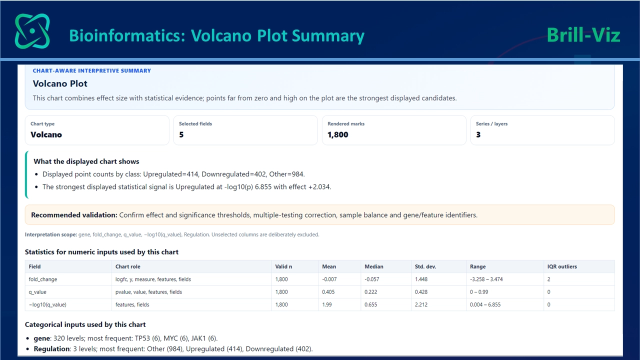
Threshold-based selection from a volcano plot can introduce statistical problems, particularly when researchers treat visual cut-offs as independent confirmation. Candidate genes normally require biological context, multiple-testing control, independent validation and supporting evidence.
Readers can explore a practical example through NCBI’s GEO2R guide to volcano plots, which demonstrates how statistical significance is compared with the magnitude and direction of gene-expression change.
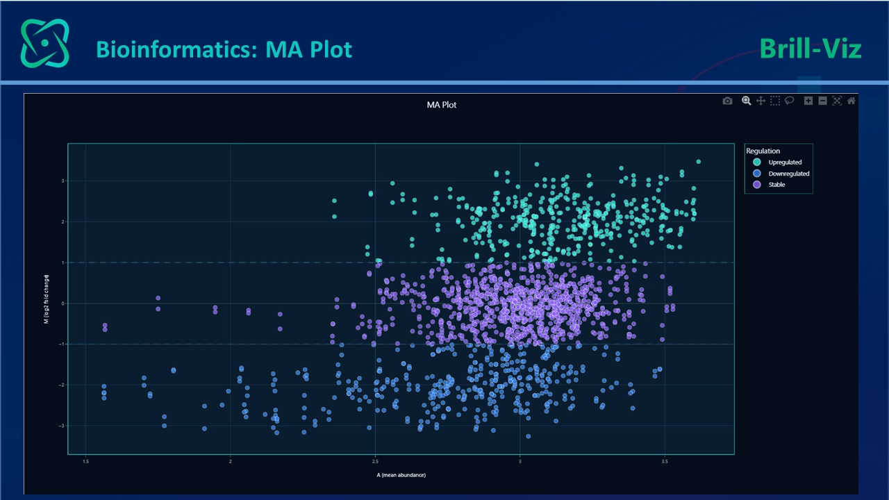
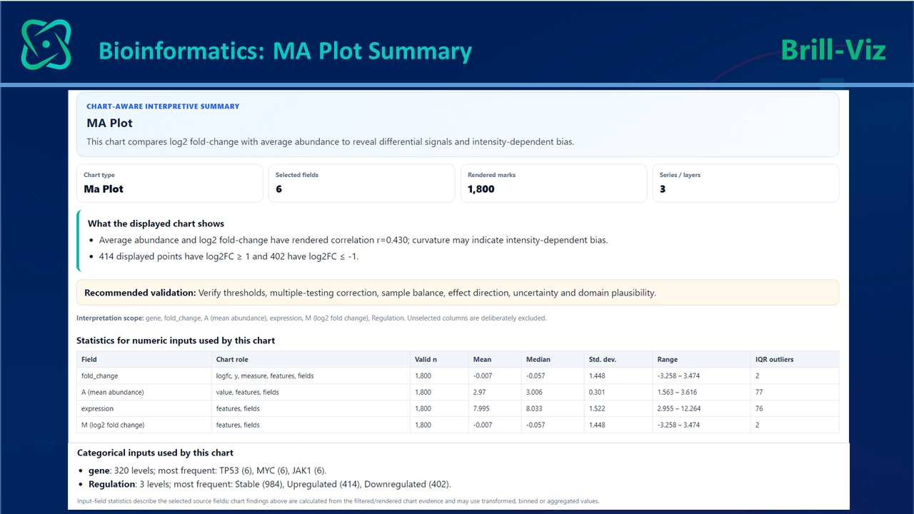
2. MA Plot: Checking Whether Change Depends On Expression Level
The MA plot complements the volcano plot.Its horizontal axis represents average expression or signal intensity. Its vertical axis represents the difference between groups, often as log fold change.
This enables the analyst to examine whether the magnitude or variability of expression change depends on the underlying abundance of a gene. MA plots are a standard part of gene-level differential-expression workflows.
A well-behaved MA plot commonly shows most observations distributed around zero, with greater variability sometimes appearing among low-expression features.
3. Manhattan Plot: Locating Association Signals Across The Genome
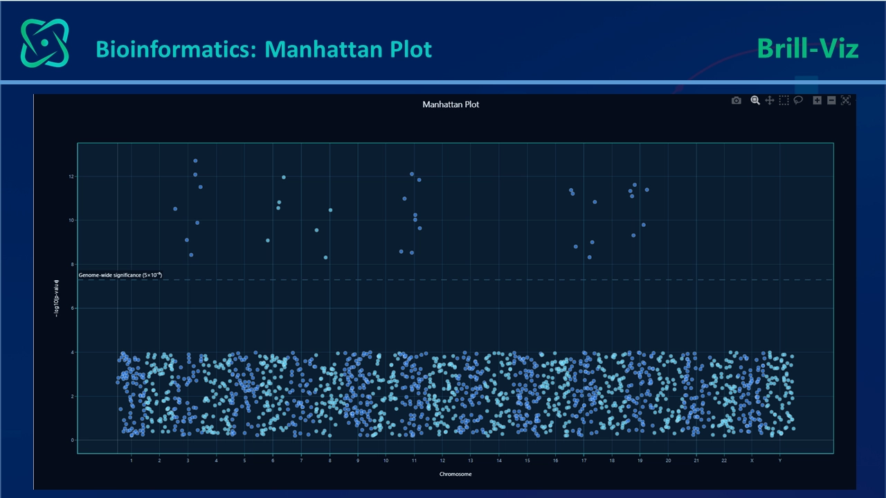
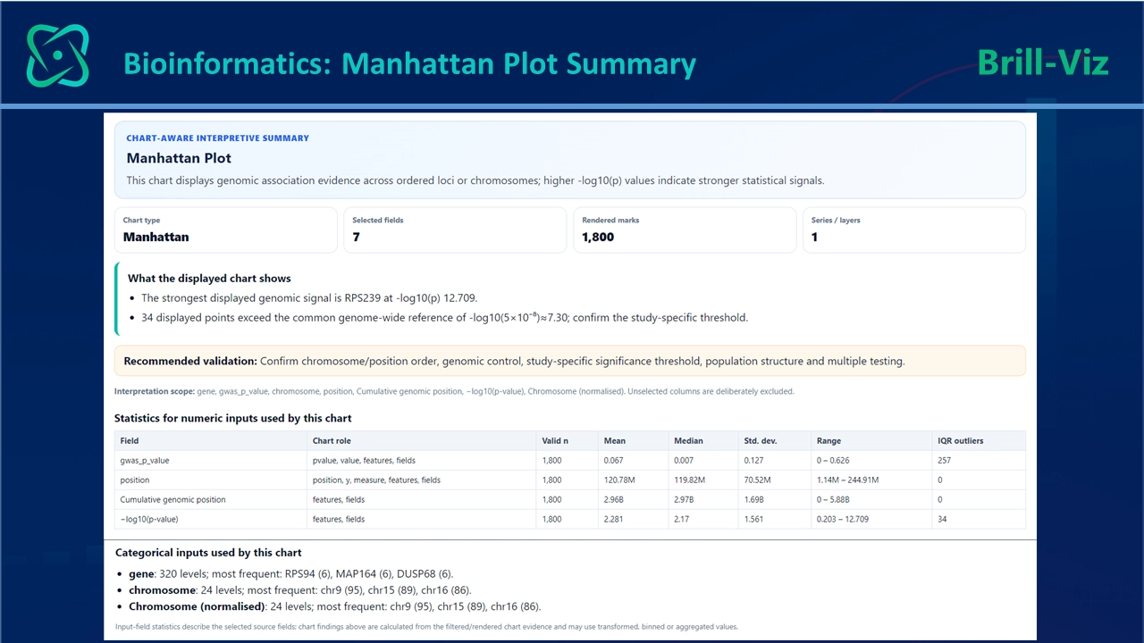
A Manhattan plot is commonly used to summarize results from a genome-wide association study. The horizontal axis represents genomic position across successive chromosomes. The vertical axis shows the strength of association, usually as as −log₁₀(p), meaning the negative base-10 logarithm of the p-value. Each point represents a tested genetic variant.
The chart receives its name because strong groups of association signals can resemble the skyline of a city. Alternating chromosome colors are not merely decorative. They help readers distinguish the genomic boundaries between neighboring chromosomes.
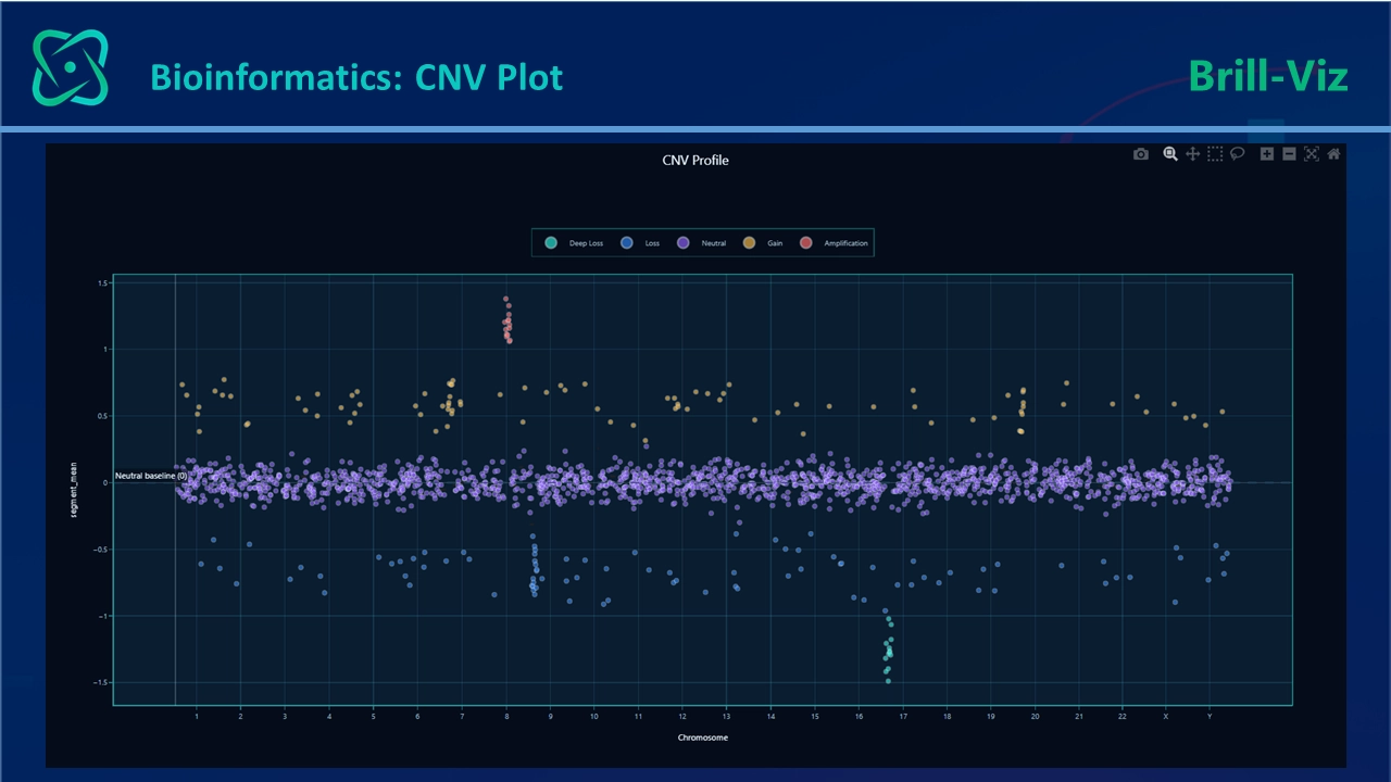
4. CNV Profile: Identifying Gains And Losses Of Genomic Material
Most human genes are normally present in two copies, one inherited from each parent but sections of DNA can sometimes occur in greater or fewer numbers. These changes are known as copy-number variations. They can include gains or losses affecting parts of a chromosome or, in some cases, much larger regions.
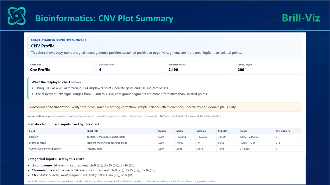
A CNV profile visualizes copy-number measurements across genomic position. Values above a baseline may indicate gains, while values below it may indicate losses. In cancer genomics, such profiles can reveal regions of amplification or deletion that may be associated with tumor development or progression.
5. Expression Heatmap: Seeing Patterns Across Genes And Samples
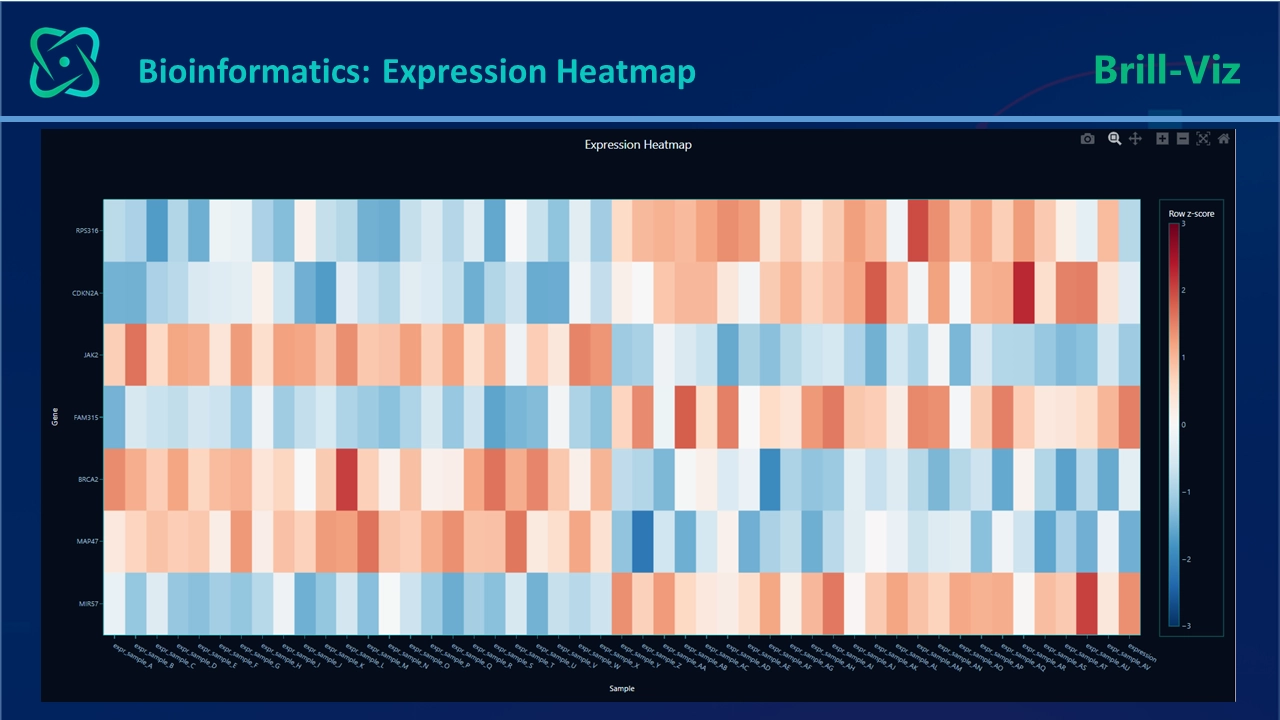
An expression heatmap displays a matrix in which:
Clustering can rearrange genes and samples so that similar patterns appear next to one another.
This can reveal:
The visual is powerful because it shows many relationships simultaneously. But it can also be deceptive. Colors depend on normalization, scaling, selected genes, distance measures and clustering methods.
A heatmap is therefore best treated as an exploratory map, not as independent proof that identified clusters represent genuine biological classes.
6. PCA: Reducing Thousands Of Variables Into Major Patterns
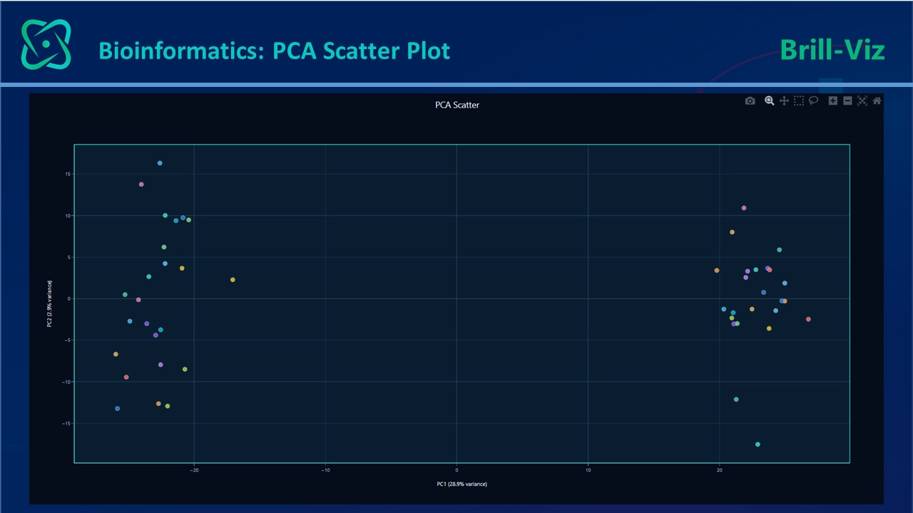
Gene-expression and other omics datasets are often described as high-dimensional because every gene, protein or metabolite may act as a separate variable.
A two-dimensional screen cannot display thousands of dimensions directly.Principal component analysis, or PCA, transforms the original variables into new components that capture major directions of variation. A PCA plot commonly displays the first two components.
Samples positioned close together have similar profiles according to the variation represented by those components. Samples far apart are more dissimilar.
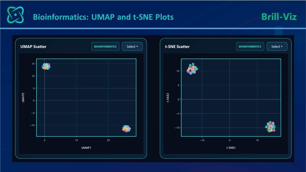
7. UMAP And T-SNE: Exploring Complex Local Structures
UMAP and t-SNE are nonlinear dimensionality-reduction techniques commonly used to represent complex biological datasets in two dimensions. They are especially familiar in single-cell analysis, where thousands of cells may each contain measurements across thousands of genes.
These methods can reveal local groupings that may be difficult to see with a linear method such as PCA. Dimensionality reduction is widely used to visualize broad trends and explore cellular distributions in high-dimensional data. However, the geometry of a UMAP or t-SNE plot must be interpreted carefully.
The presence of visible islands does not prove the existence of distinct biological populations. Results can be influenced by preprocessing, parameter choices, initialization, selected features and the number of dimensions used before embedding. Comparative evaluations have shown that dimensionality-reduction methods differ in how well they preserve local and global structure and in their sensitivity to analytical choices.
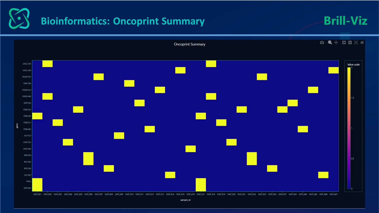
8. Oncoprint: Summarizing Alterations Across Genes And Samples
An oncoprint is a compact visualization of genomic alterations across multiple genes and samples. Rows usually represent genes, columns represent patients or biological samples, and colored marks indicate alteration types such as:
Oncoprints are particularly useful for observing mutation frequency, co-occurrence and apparent mutual exclusivity. They provide a concise summary of genomic alterations across a cohort.
9. Pathway Enrichment: Moving From A List Of Genes To Biological Meaning
Differential-expression analysis may produce hundreds or thousands of genes.Even when each result is statistically correct, a long gene list can be difficult to interpret.Pathway enrichment analysis groups genes according to known biological functions or processes. Instead of asking only, “Which genes changed?”, the analyst begins asking:
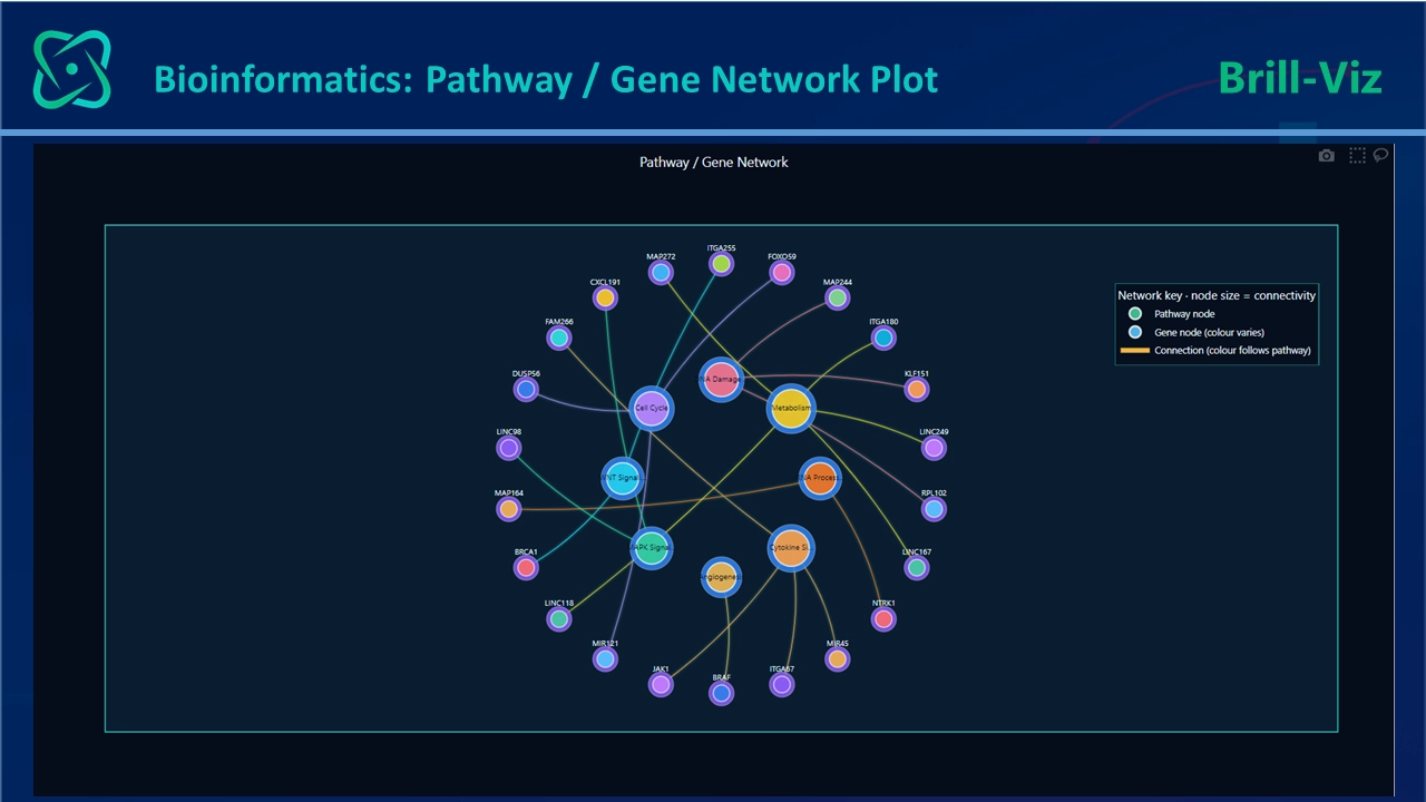
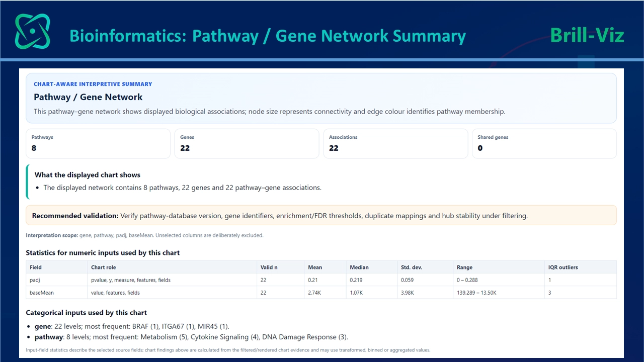
This is often where bioinformatics moves from statistical detection toward biological interpretation.
A pathway chart may display:
The Charts That Protect The Analysis
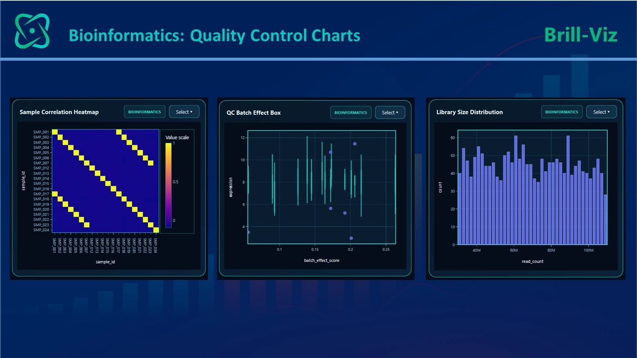
The most visually dramatic bioinformatics charts often receive the most attention.
However, quality-control visuals may be even more important.
These charts may not be as attractive as a volcano or Manhattan plot, but they help answer a fundamental question: Are we looking at biology, or at an artifact created by the data-generation process?
Why Every Dataset Should Not Generate Every Specialist Chart
A chart registry may contain dozens of visual types, but this does not mean that every chart should appear for every dataset.
Each bioinformatics visual has minimum data requirements.
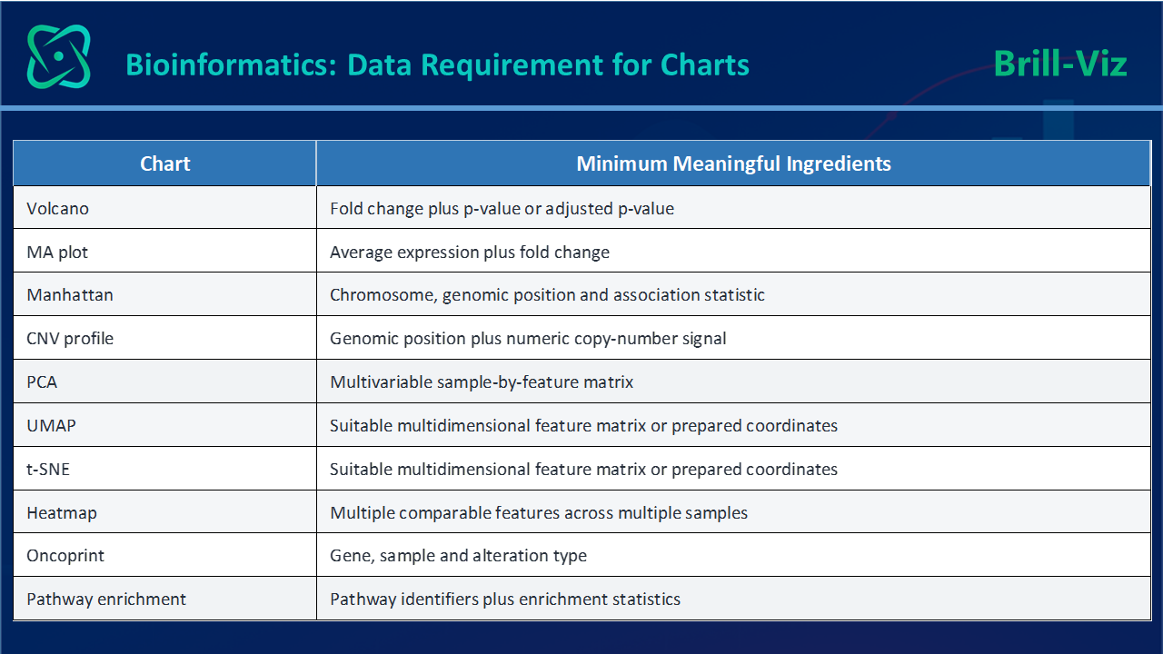
When the required information is absent, three approaches are possible:
The third option is normally the most responsible.An empty chart adds clutter and confuses the reader. A substitute-variable chart is more dangerous because it may look convincing while representing the wrong scientific concept.
This distinction is central to responsible specialist analytics: A technically successful plot is not necessarily a scientifically valid plot.
From Separate Charts To A Biological Story
A major challenge in bioinformatics is that no single visual tells the complete story.
Imagine a study comparing diseased and healthy samples. A responsible visual sequence might look like this:
Making Bioinformatics Visualization More Accessible With Brill-Viz
Specialist bioinformatics environments are powerful, but they can demand programming, package management, knowledge of data structures and familiarity with several analytical workflows.
That technical depth is appropriate for expert research. However, it creates a considerable entry barrier for analysts, healthcare professionals, students, managers and researchers who want to explore prepared biological results without developing a full computational pipeline.
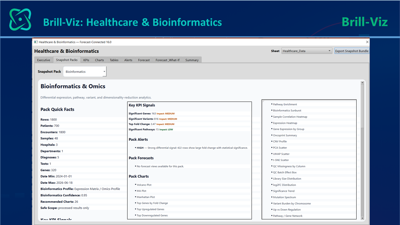
Brill-Viz approaches the challenge from the perspective of guided visual intelligence. Its Healthcare and Bioinformatics Snapshot environment can:
The template includes specialist visual families covering differential expression, dimensionality reduction, genomic association, copy-number variation, mutation patterns, pathway analysis and quality control.
This does not turn a general analyst into a molecular biologist, nor should it attempt to replace specialist bioinformatics pipelines; Its value lies elsewhere.
It can reduce the distance between:
Brill-Viz can therefore serve as a bridge between ordinary analytical familiarity and specialist biological visualization.
Responsible Interpretation Remains Essential
Accessible software does not remove the need for scientific judgment.
Bioinformatics visuals should be interpreted in the context of:
A visual summary can help analysts recognize patterns, generate questions and communicate findings. It should not be used to transform an exploratory signal into a clinical conclusion without appropriate evidence.
This is especially important in healthcare, where overinterpretation may influence research direction, resource allocation or clinical expectations.
The objective of accessible bioinformatics visualization should therefore not be to make complex science appear simple.
It should be to make the complexity more understandable, more transparent and easier to investigate responsibly.
Key Takeaways
Closing Remarks
Bioinformatics is often presented as a highly specialized discipline accessible only through coding, advanced statistics and molecular expertise. Its methods certainly require care.
But its central questions are not beyond the reach of ordinary analysts:
Which biological features changed?
How strong was the evidence?
Where in the genome did the signal occur?
Which samples behaved similarly?
Could the pattern be technical rather than biological?
Which genes may work together?
Which pathways may help explain the observation?
Specialist visualizations such as Volcano, MA, Manhattan, CNV, heatmap, PCA, UMAP, t-SNE, oncoprint and pathway-enrichment plots translate these questions into visible patterns.
Learning to read them does not make someone a bioinformatician overnight. It does something equally valuable: it gives analysts the vocabulary to engage with a field that is becoming increasingly important to biomedical research, personalized medicine and data-driven healthcare.
And when software combines relevant chart selection, scientific data safeguards, basic statistics and interpretive guidance, bioinformatics visualization becomes less mysterious—without pretending that the underlying science is simple.
That is the opportunity for tools such as Brill-Viz: