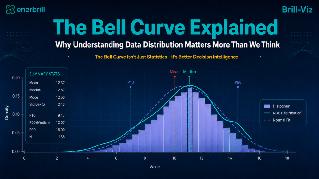
The Average is Only The Beginning
Open almost any business report and averages jump off the page: average sales, average production, average profit, average cost. They are tidy, comforting, and almost always incomplete. An average answers exactly one question - what is typical? - and stays silent on everything else.
For real decisions, that is rarely enough. Decision-makers also need to know whether performance is consistent, how much variation exists, whether extreme values are common, whether risk is hiding in the tails, and whether different groups behave differently underneath that one tidy number. Those questions cannot be answered by the average alone. They require an understanding of the distribution - the full pattern of values around the center.
Beyond the Average: Same Mean, Different Risk
Consider two manufacturing plants, both proudly reporting an average product weight of 100 grams:
The average is identical, but the business meaning is completely different. Plant A appears stable and predictable. Plant B may create rejects, customer complaints, rework, or quality-control failures. The average did not reveal the problem; the distribution did.
What Is a Bell Curve?
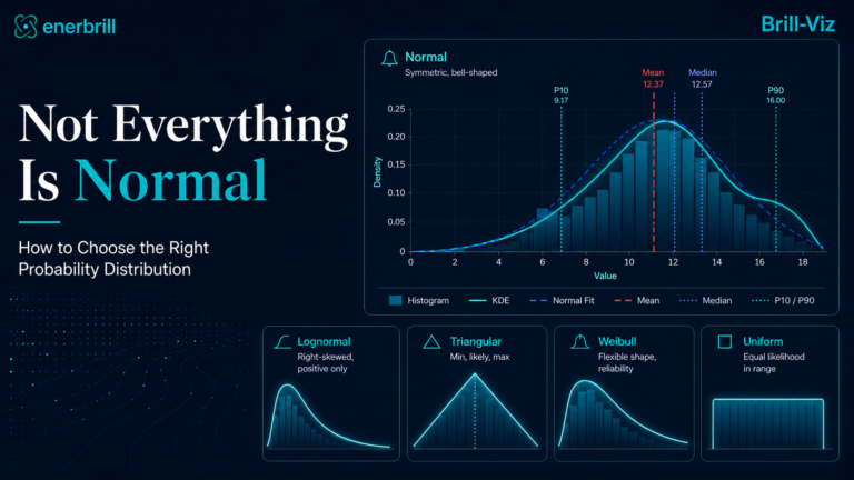
A bell curve is a smooth, symmetric snapshot of how values are spread out - the classic shape of the Normal Distribution. In an approximately normal dataset, most values huddle near the center, and extremes get rarer the further out you go.
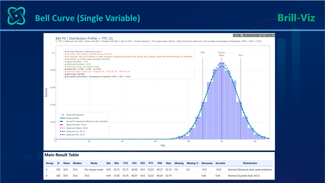
Many measured variables can be approximately normal when the final result reflects many small, independent, additive effects. Human height, measurement error, manufacturing tolerances, laboratory measurements, and some averaged scientific observations are common examples.
This pattern has a name: the Central Limit Theorem. It states that when a result is the sum of many small, independent influences, the outcome tends toward a Normal Distribution regardless of how each individual influence is distributed, which is why the bell curve shows up so often across unrelated fields.
But the most important lesson is not that data should look normal. It is that the shape itself contains information. A bell curve is one possible pattern, not a rule that every dataset must obey.
Histogram vs. Fitted Curve
A histogram and a fitted curve answer different questions.
Used together, they are much more informative than either one alone. The histogram shows reality. The fitted curve shows structure. The statistics explain the meaning.
Histogram is an essential part of bell curve analysis because it shows the distribution actually observed in the data. NIST’s guidance on histograms explains that they can reveal the centre, spread, skewness, outliers, and multiple peaks, helping analysts assess whether a fitted probability model reasonably represents the data.
Count, Frequency, and Density Views
Distribution charts can be displayed in several related ways:
Count is useful when sample size matters. Density is especially useful when the goal is to compare the observed shape with theoretical probability models.x
Why the Shape of Data Matters: The Risk Story
The shape of a distribution can reveal important operational and business behavior:
Distribution analysis is therefore much more than drawing a curve. It is a way of reading hidden behavior inside data.
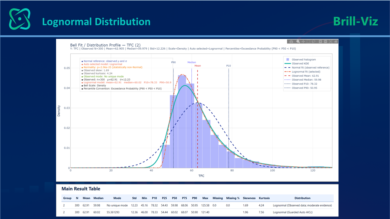
The Statistics Behind the Bell Curve:
A useful bell-curve analysis combines visual shape with a small set of statistics. Each statistic tells a different part of the story.
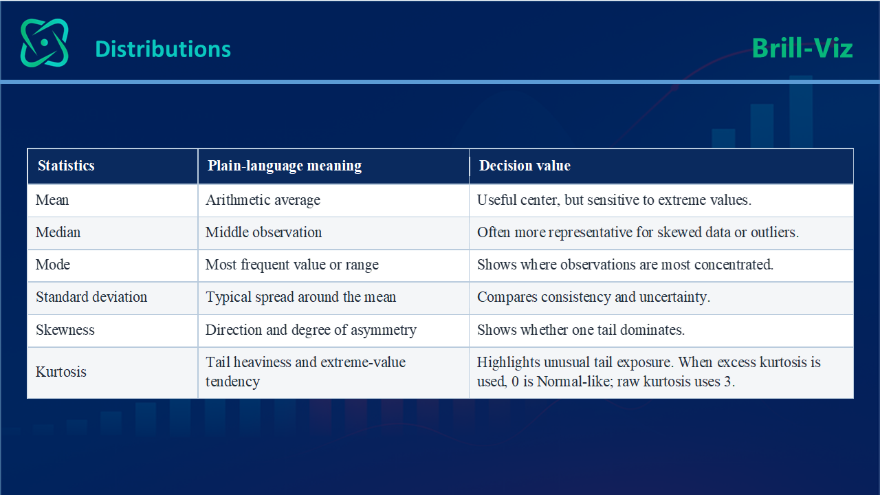
P10, P50, and P90: State the Convention
Many decisions require a range rather than one number. P10, P50, and P90 help describe uncertainty around a central case. P50 is usually the median or central estimate, while P10 and P90 describe outcomes toward the two sides of the distribution.
However, these labels are used in two different conventions, and the distinction is essential.
The calculation is not enough, the convention must be stated clearly so the result is interpreted correctly.
Risk And Uncertainty Are Related, But Not The Same
Uncertainty describes what is not known: the possible values, outcomes, or timing and their probability range. Risk describes the consequence of that uncertainty for an objective.
For instance, production between 80 and 120 units is an uncertainty range. If production below 90 causes a supply shortage or financial loss, that downside consequence is risk. Distribution choice affects the modelled uncertainty; risk emerges when those probabilities are connected to consequences.
Probability Turns Uncertainty Into Something Measurable
Real-world decisions rarely come with complete certainty. Sales move, production varies, costs overrun, customer behavior shifts, reservoir properties change, and equipment can fail earlier or later than expected.
Probability provides a practical language for describing that uncertainty. Instead of saying, "The value will be 100," we can say, "The central case is around 100, while most expected outcomes may fall between 80 and 120." The second statement is more honest and far more useful for planning.
Uncertainty can be reported through standard deviation, variance, confidence intervals, prediction ranges, percentiles, fitted distributions, simulation outputs, and low/base/high scenarios. These measures help answer practical questions:
Distributions do not remove uncertainty. They make it visible, measurable, and reportable - which is the foundation of better decision intelligence.
Does a Bell Curve Give a p-Value?
No. A bell curve is a visual impression; a p-value comes from a statistical test. Brill-Viz applies the Shapiro-Wilk normality test, producing a p-value that indicates whether the observed data is reasonably consistent with a Normal Distribution.The chart provides visual understanding, while the test provides statistical evidence. A good analyst uses both and avoids relying blindly on either one.
The Full Dataset Can Hide Group-Level Risk
A full dataset may look normal or lognormal even when its underlying groups behave very differently. One branch may be tightly controlled, another may be strongly skewed, and a third may contain extreme values. When these groups are combined, the full-dataset average can hide the differences that matter operationally.
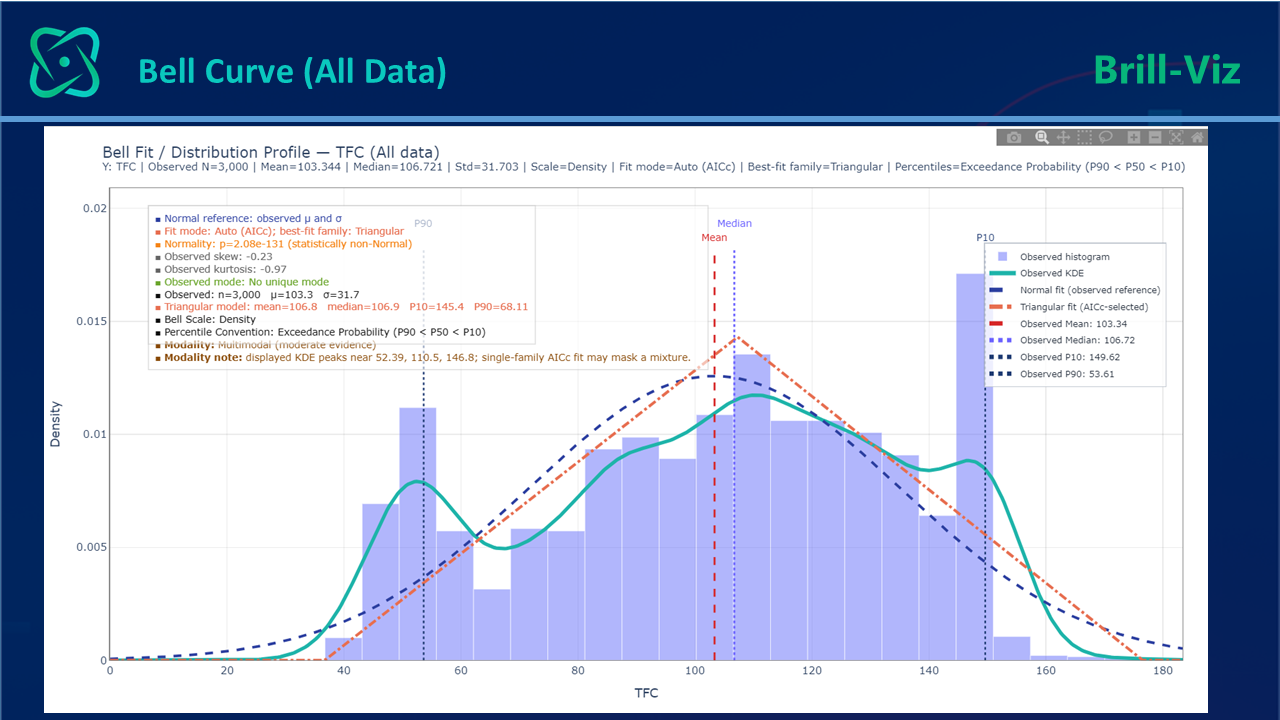
Grouped distribution analysis is powerful because many real decisions are made at group level:
The full average may hide the issue; the group distributions may reveal it.
How Brill-Viz Makes Bell-Curve Analysis Easier
Done properly, distribution analysis is a lot of work: histogram binning, frequency or density calculations, fitted curves, descriptive statistics, percentiles, normality tests, best-fit comparisons, repeated group filtering, and report formatting. In a spreadsheet or a typical BI tool, that is a dozen manual steps, repeated for every variable and every group.
Brill-Viz collapses all of it into one workflow - from raw data to statistical understanding, with no formulas, no Python or R, and no separate statistical package to learn.
Brill-Viz Understand the Overall Distribution
'Smart-Stats' and 'Grouped Stats' are the two statistical analytical modules inside Brill-Viz, which provide analytical starting point whenever you need to understand how one variable behaves overall. Point them at a column, and they will answer:
Smart-Stats gets its own deep dive in an upcoming article. For now, we will walk through the same ideas using Brill-Viz's Grouped Stats function.
Grouped Stats: Compare Distribution Behavior
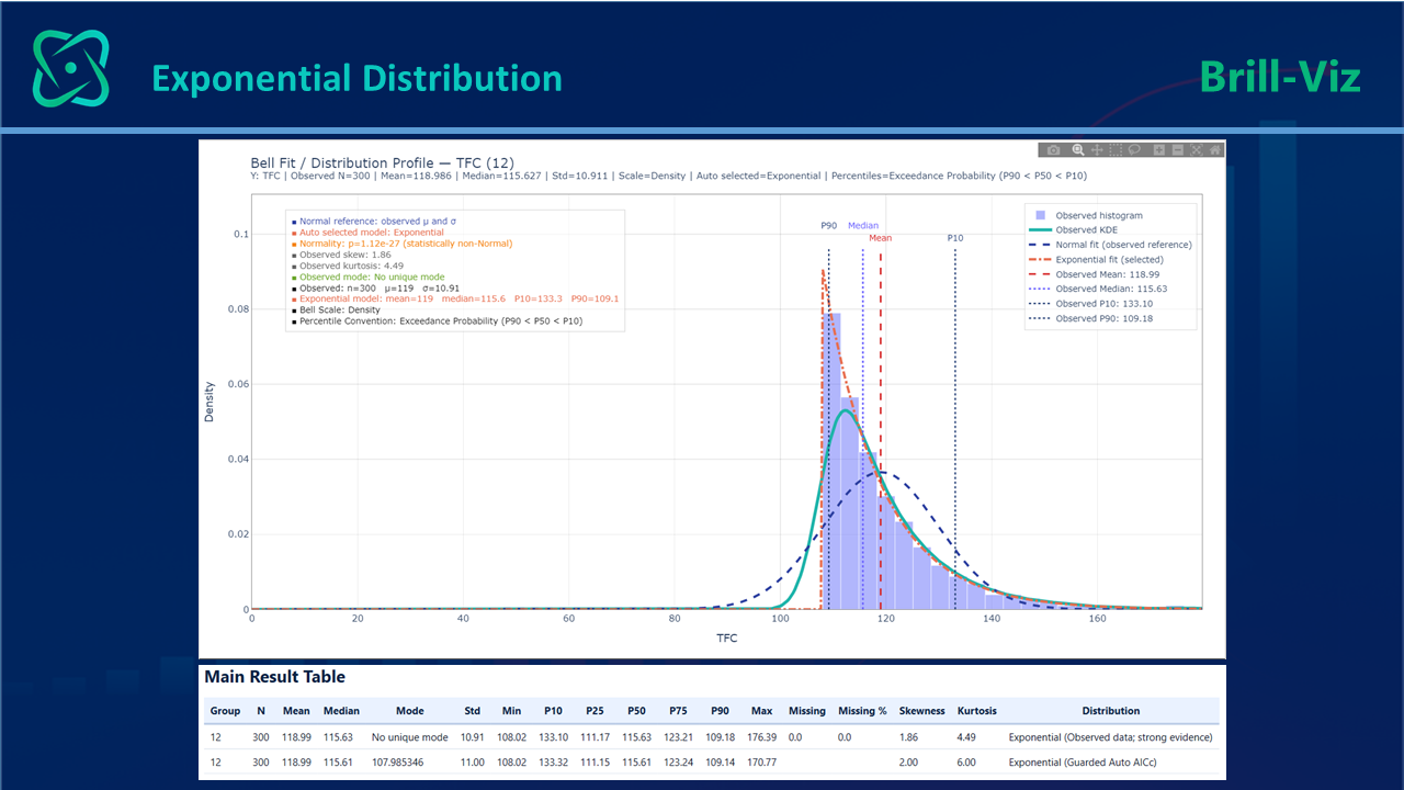
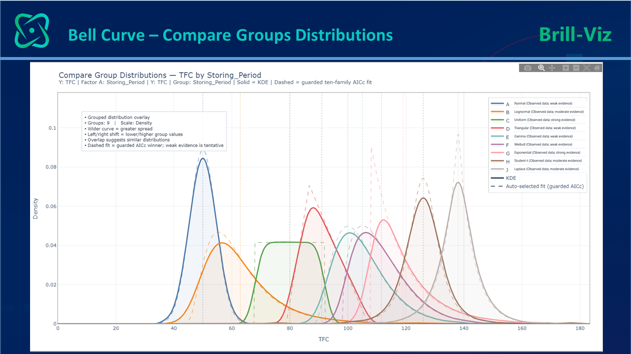
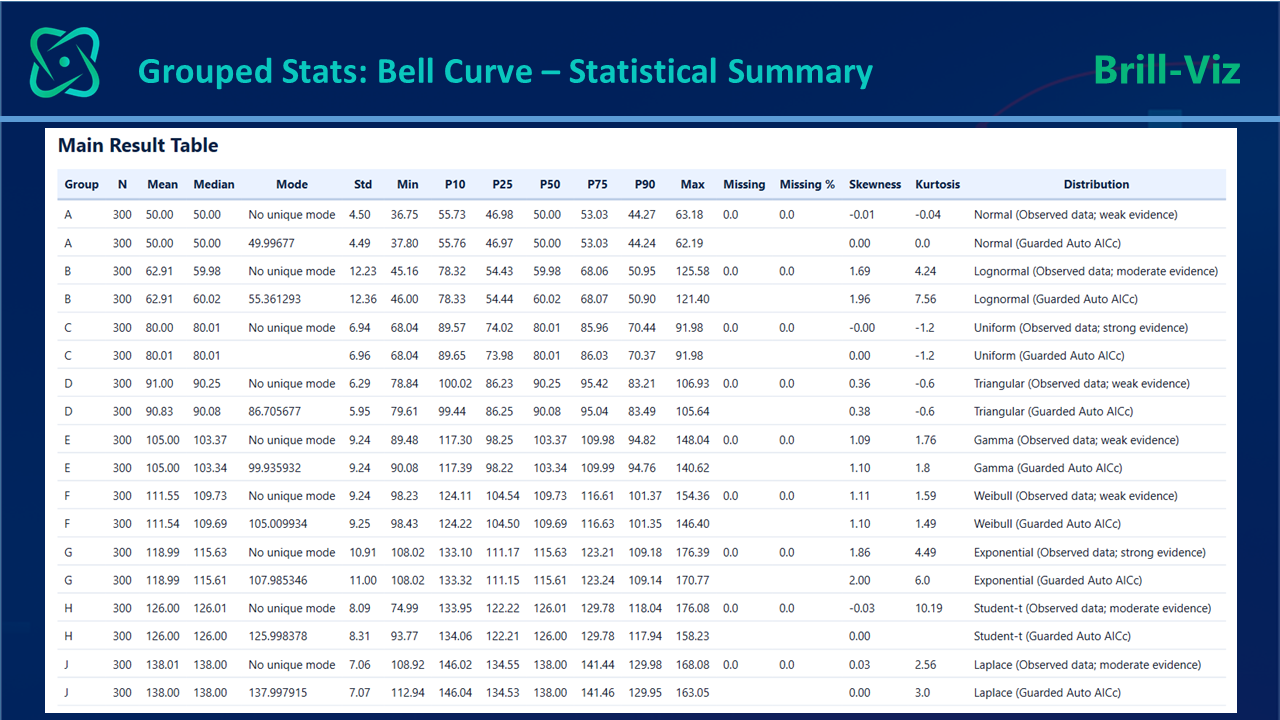
Grouped Stats extends the analysis by comparing distributions across categories. It can show which group is most stable, which group is most uncertain, which one has the widest P10-P90 range, and whether different groups follow different distribution patterns.
From Chart to Interpretation
A bell curve should not be treated as decoration. A useful interpretation should answer four questions rather than merely naming the curve:
That is the point at which a chart becomes decision intelligence: the user moves from seeing a shape to understanding what that shape means for risk, reliability, consistency, and action
Key Takeaways
Closing Remarks
Every dataset has a story to tell. The average tells one chapter; the distribution reveals the plot. It shows whether the data is stable or uncertain, concentrated or scattered, symmetric or skewed, predictable or risky.
Averages support reporting. Distributions support understanding - and understanding supports better decisions.