The Question That Swallowed Weekend
A data analyst walks into a meeting. This is not the start of a joke, it is the start of a project scope nobody bothered to write down.
The manager asks what happened, why it happened, and what will happen next, but the analyst hears three different assignments: describe the past, diagnose the present, and negotiate with the future.
By the end of the meeting, the “quick analysis” has quietly acquired a dashboard, a forecast, a statistical test, a specialist chart, a management summary, and the phrase “nothing too complicated”.
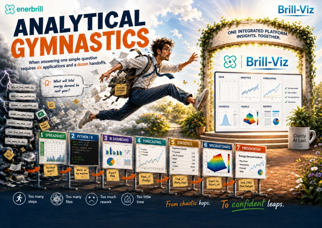
Welcome to Analytical Gymnastics: the modern workplace sport in which professionals vault between spreadsheets, BI dashboards, Python or R, statistical tools, specialist visualizations, and presentation slides, all while keeping one dataset alive long enough to cross the finish line.
No helmet is provided....
Warm-Up Event: Spreadsheet Archaeology
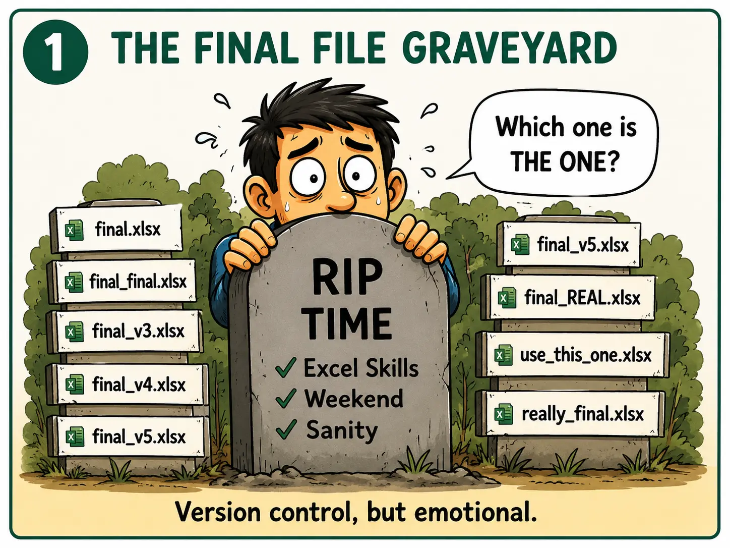
It always starts innocently. Someone sends a spreadsheet called Sales_Current.xlsx. Beside it are Sales_Current_FINAL.xlsx, Sales_Current_FINAL_Updated.xlsx, and Sales_Current_FINAL_Updated_USE_THIS_ONE.xlsx.
The analyst is now less a data professional and more an archaeologist, carbon-dating filenames to determine which civilization created the latest revenue total.The workbook contains twelve sheets, three hidden columns, two merged headers, one circular reference, and a date column that treats “date” as more of a suggestion: 12/05/2026, May-26, “last Tuesday,” and 45874.
A product code has lost its leading zero and begun a new career as an integer. A percentage is stored as text. A blank cell contains a space, which is technically not blank and spiritually very committed to the role.
The analyst cleans, renames, fills, checks, recalculates. The totals change anyway. Nobody knows why. Python starts to look peaceful by comparison.
Event One: The “Quick” Forecast
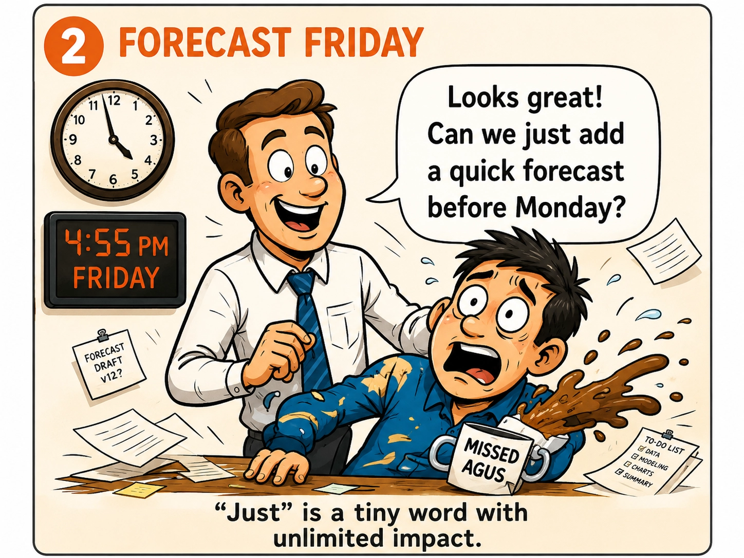
It is 4:55 pm on Friday. The report is finished. The analyst is emotionally in the car park.
Then a message arrives: “Looks good. Can we just add a six-month forecast before Monday?”The word “just” has ruined more weekends than any documented software bug.
A BI tool can draw a forecast line in seconds, and for clean, stable data, that line might even be honest. Real-world data, however, have hobbies. Sales respond to promotions. Demand follows seasons. Costs react to inflation. Hospital activity changes with outbreaks. Production stops for maintenance. Customers behave like customers.
Now the analyst must consider trend, seasonality, missing periods, structural breaks, model selection, backtesting, forecast error, confidence intervals, external drivers, and whether the optimistic dotted line is a forecast or simply a motivational poster.
Event Two: The Python/R Hurdles
Python and R are powerful, reproducible, and capable of serious analytical work. They can also require fourteen lines of code to persuade one column that it contains numbers.
The analyst begins confidently------ df = read_the_data("sales_data.xlsx")
A little later, the working object is named final_cleaned_v2_fixed_really_final. A warning appears. A dependency is missing. The environment has changed. A package has been updated. The function used last month is now deprecated, which is software’s polite way of saying, “I remember you, but I no longer respect your choices”.
The analyst searches for help and finds eight solutions: two are outdated, three belong to another library, one works only on a different operating system, one creates a more interesting error, and one begins with “simply rebuild from source”.
The analyst only wanted a quarterly forecast.
Event Three: The Statistical High Jump
The dashboard is finally ready when someone asks, “But is the difference statistically significant?”
The bar chart stands there looking colorful and noncommittal.
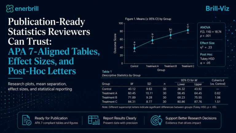
A t-test is considered, then ANOVA then assumptions; Then post-hoc comparisons then effect sizes, confidence intervals. Then a discussion about whether statistical significance is the same as practical significance, during which several meeting participants suddenly develop urgent calendar conflicts.
Four hours later, the analyst explains that Group A appears meaningfully different from Group B.
Event Four: The Chart From Another Analytical Universe
Routine dashboards are comfortable with bars, lines, maps, cards, KPIs, and the occasional pie chart that has survived every warning ever written about pie charts.
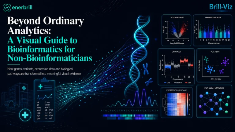
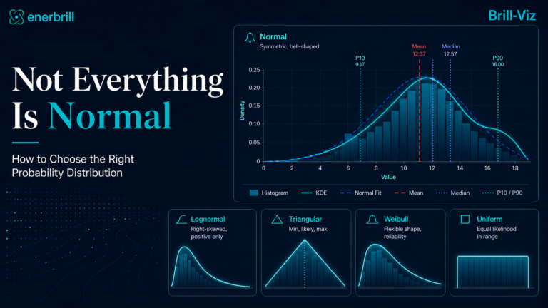
Then a client asks for a probability distribution, a PCA plot, a ternary diagram, a network graph, a volcano plot, a Manhattan plot, or a simulation with P10, P50, and P90 outcomes.
The analyst opens the chart menu. The chart is not there. A custom visual exists, but it has not been updated since the last geological era. Another requires payment. A third needs JavaScript. A fourth produces something technically correct but visually similar to an electrical wiring accident.
Back to Python or R. The data take another international flight. Their luggage is lost somewhere between column names and category encodings.
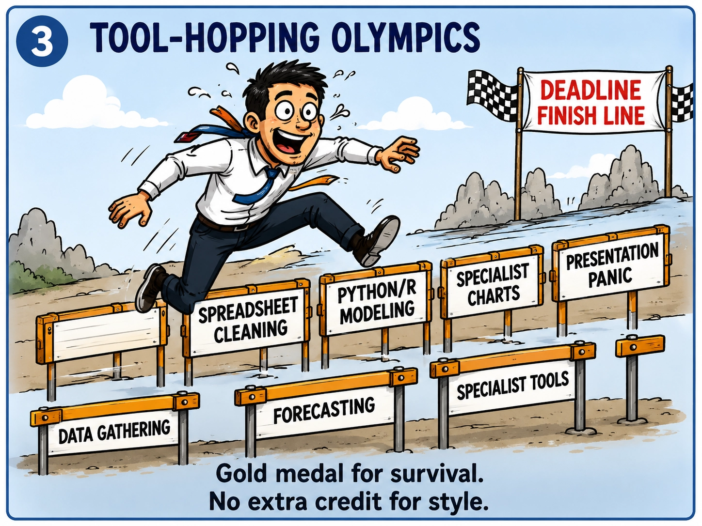
Event Five: The Dashboard Return Journey
The advanced work is complete, so the results must return to the BI dashboard. The forecast is imported. The statistical table is simplified. The specialist chart becomes an image. The assumptions disappear because they do not fit inside the tile.
Everything looks professional again. Then someone changes a filter, the dashboard updates, but externally created forecast does not. The imported chart remains frozen in a previous reality, smiling calmly while the numbers around it move on with their lives.
The analyst quietly begins the entire process again, now with the peaceful expression of someone who has accepted fate.
Event Six: The Presentation Landing
Eventually, all analytical roads lead to a presentation.
A chart arrives from the dashboard. A table comes from the statistics tool. A forecast comes from code. A specialist visual arrives as an image. A summary is typed manually while the analyst attempts to remember which filter was active when the screenshot was taken.
The presentation accepts them all without judgement.
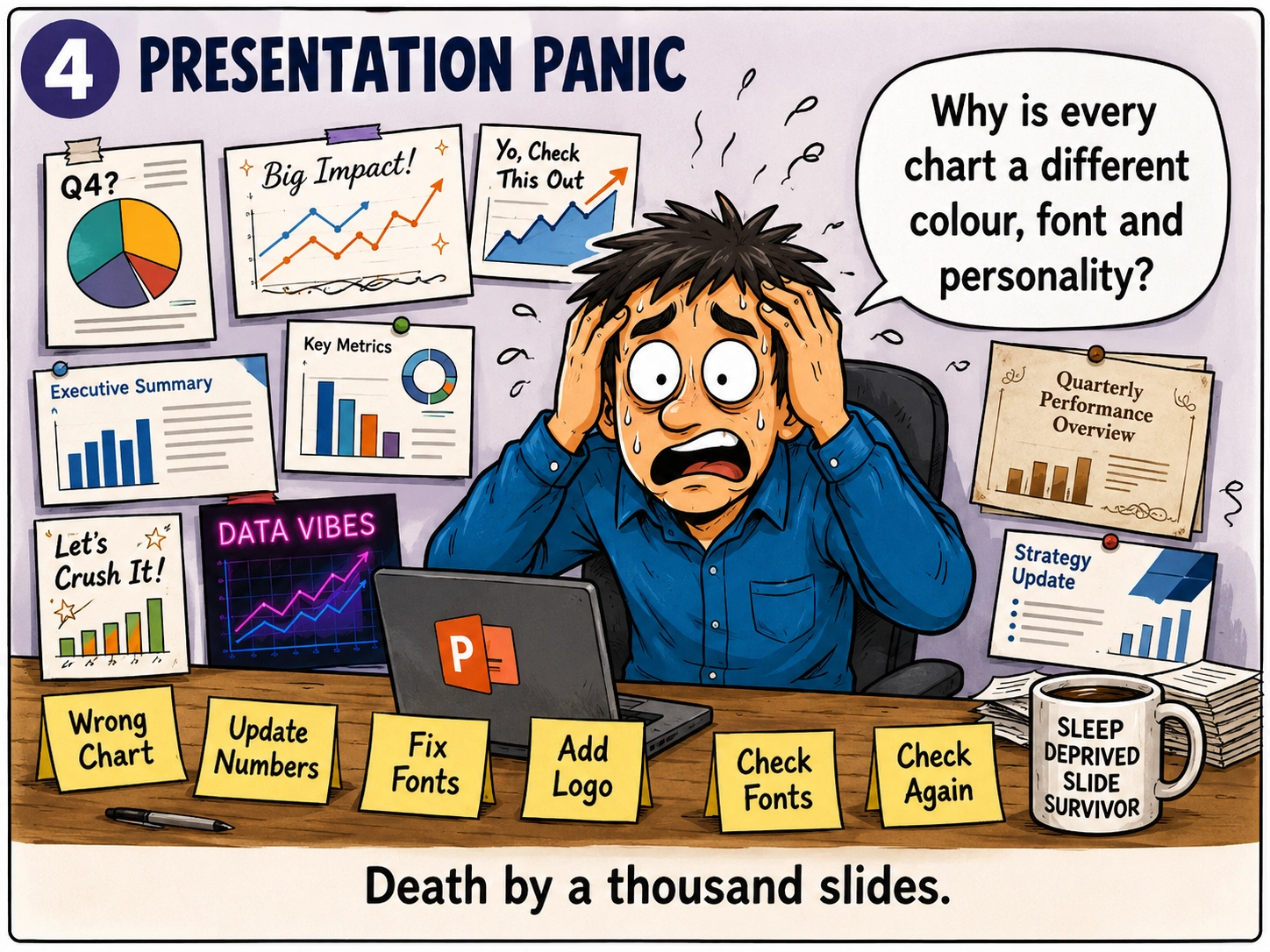
The result resembles a family reunion in which nobody agreed on the dress code. Fonts vary. Colours disagree. Decimal places change from slide to slide. One legend is inside the plot, one is outside, and one has disappeared after a disagreement with the layout.
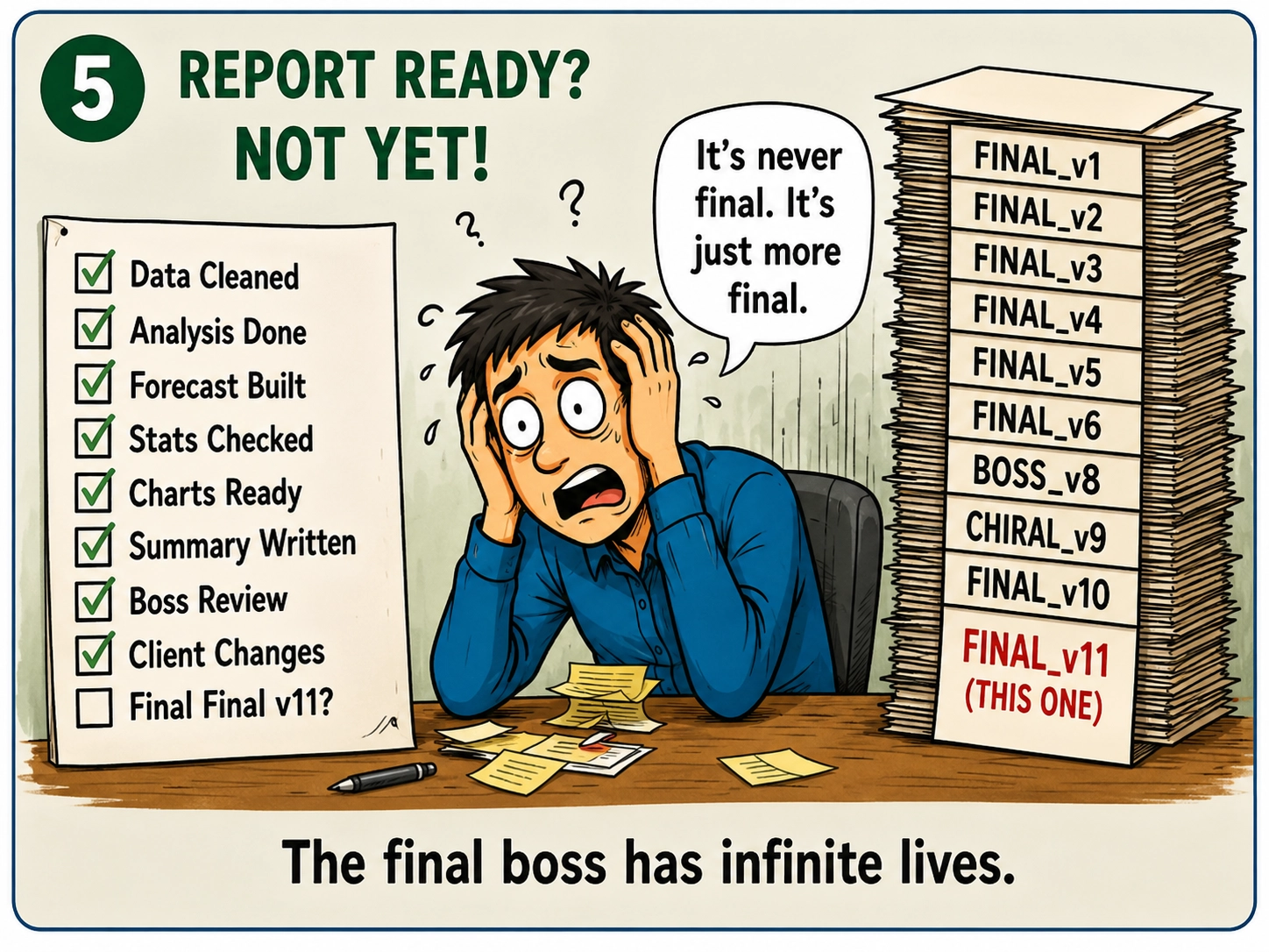
The file is saved as Quarterly_Analysis_Final, then Quarterly_Analysis_Final_Updated,
then Quarterly_Analysis_Final_Updated_Management.
Finally: Quarterly_Analysis_Final_Updated_Management_USE_THIS_ONE_v11.
Do Analysts Really Go Through All This?
Not every analyst runs the full routine daily. Most work is manageable: cleaning, KPIs, comparisons, trends, dashboards, summaries; the kind of thing a spreadsheet or BI tool handles just fine.
But the obstacle course does not need to appear every day to become a serious problem. It only takes one request:
Suddenly, the routine dashboard project develops ambitions. That is when the analyst begins stretching.To be fair, no analyst hits all seven events in one calendar day. Most hit all seven within a single year. often during the same budget cycle. That is the part that is funny and true at the same time.
The Real Problem Is Not the Tools
Spreadsheets are not the enemy. Neither are BI tools, Python, R, statistical packages, specialist applications, or presentation software. Each is excellent at exactly what it was built for.
The real problem is the distance between them. Every handoff creates another opportunity for column names to change, dates to mutate, categories to become numbers, filters to disappear, units to vanish, assumptions to be forgotten, and results to be copied manually into a new location.
The analyst is no longer simply analyzing data. The analyst is operating a small international migration program for spreadsheets.
A fragmented data analytics workflow can create many of the same problems as data silos. IBM explains that isolated information across spreadsheets and specialized systems can lead to inconsistent data, duplicated workflows and reduced data quality.
Then Brill-Viz Walks Into the Story: The Data Analytics Workflow
This is the moment where the blog stops documenting suffering and starts solving it. A connected data analytics workflow reduces repeated exporting, rebuilding and manual handoffs. Microsoft describes data integration as bringing information from multiple sources into a unified view that is more accessible and usable for BI and analytics.
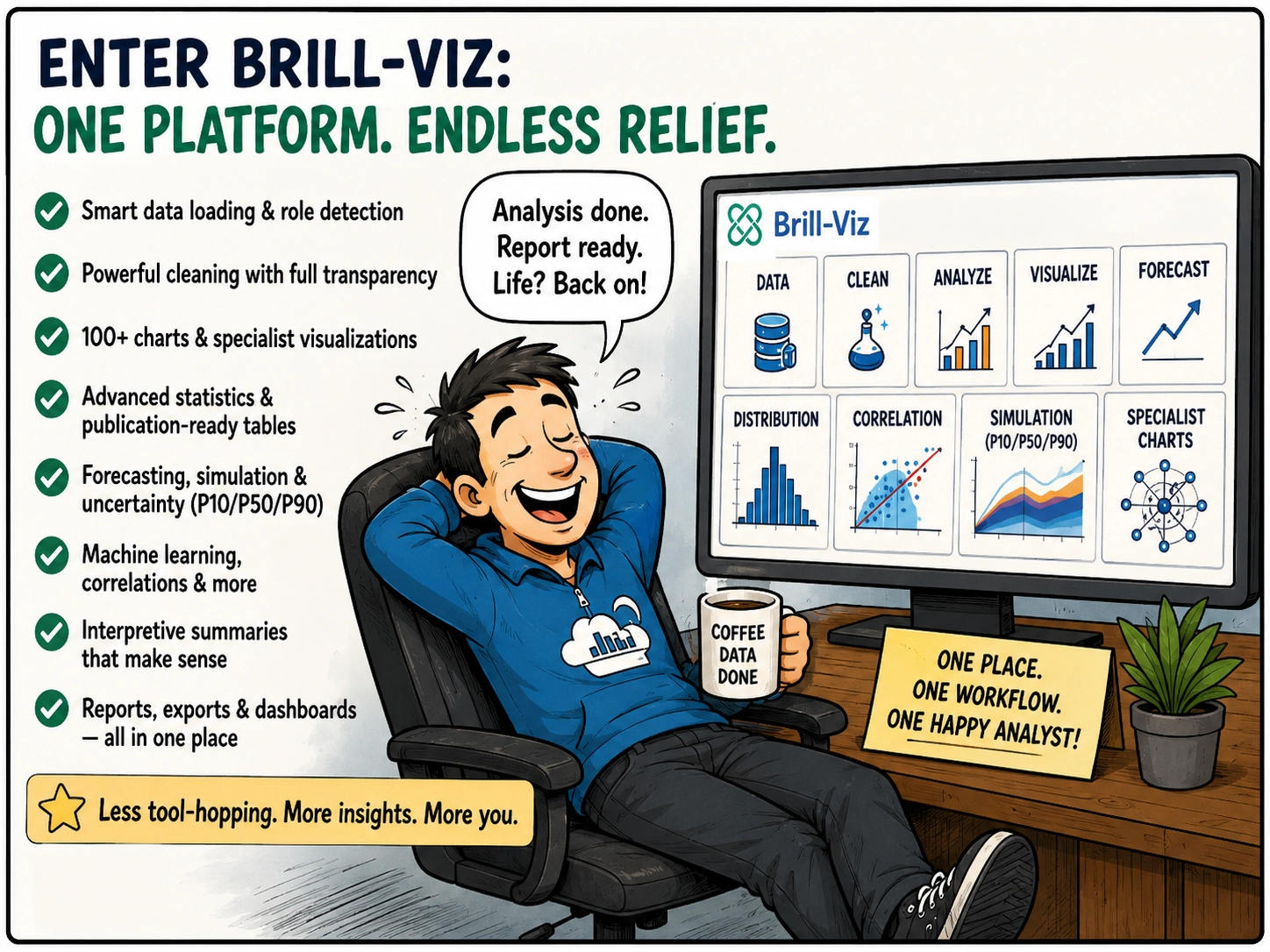
Brill-Viz works as an analytical umbrella, not a claim that one app should replace every specialist tool on Earth, but a practical way to bring the most frequently needed stages of analysis under one roof.
Instead of exporting the same dataset into a new application again and again, users move through one coherent workflow:
For highly specialised research or custom modelling, Python, R, or domain software may still be appropriate. The point is not to abolish specialist tools. The point is to stop treating them as compulsory stops on every moderately ambitious journey.
The Brill-Viz Coffee Test
Imagine the same Friday afternoon request. The manager asks for a cleaned dataset, a few KPIs, a forecast, uncertainty ranges, a specialist chart, and a short explanation before Monday. In the traditional workflow, this is where the weekend receives an unwanted calendar invitation.
With Brill-Viz, most of that journey happens under one roof: load the data, check the detected roles, review the cleaning decisions, generate the visuals, run the analysis, inspect the forecast, export the story-ready outputs.
For suitable routine and moderately advanced tasks, the work can move from “Where is the latest file?” to “Here is the answer” fast; sometimes in less time than it used to take just deciding which application to open next.The analyst presses Export.
The report is ready. The charts are ready. The forecast is ready. The summary is ready.
Kickoff Is at Eight
Now consider the ending that analytics professionals actually deserve.
The task is complete before kickoff. The analyst is sitting with friends or family, coffee in hand, watching the football match rather than watching a progress bar.
Someone scores. Someone blames the referee. Someone asks whether the report is finished.
In the old workflow, the answer would be: “Almost. I just need to export one chart, rerun the forecast, fix the legend, update the presentation, and locate the version that contains the correct filter”.
This time, the answer is one word:

Key Takeaways
The Final Whistle
Analytical Gymnastics is funny because it is true. Analysts jump between spreadsheets, code, dashboards, statistical tools, specialist visuals, and presentations, all to answer a question that sounded simple back in the meeting.
Brill-Viz offers a more connected route: fewer handoffs, fewer duplicated steps, fewer “final” files, and more time spent interpreting results rather than transporting them.
It does not remove the need for judgement. It gives judgement a better place to work.It does not promise instant answers to every analytical problem. It does make a large share of everyday and moderately advanced analysis far more convenient, coherent, and fast.
And if that means a professional can finish the work, send the answer, sip coffee, and watch football with the people who had almost forgotten what they looked like, then Brill-Viz is doing more than simplifying analytics.
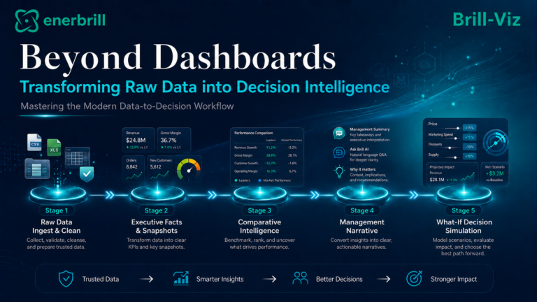
For a more detailed account on data analytics and preparing data for analytics, please read Brill-Viz blogs 'Beyond Dashboards' and 'The Hidden Cost of Bad Data', for a guided data analytical workflow from data loading, cleaning, analytics and reporting.